Benjamin Moore Pale Oak has become one of those paint colors everyone thinks they’ve seen before until it’s on the wall in real life.
I’ve used it in everything from modern farmhouses to clean transitional spaces, and it almost always gets the same reaction: “Wait what color is this?”
And honestly? That’s the magic. Pale Oak isn’t quite beige, not exactly gray, and it definitely doesn’t behave like your typical greige.
Some people see warmth right away, while others pick up on cooler undertones depending on the room. It’s gorgeous, but it’s also a color that loves to keep you guessing.
The question isn’t whether Benjamin Moore Pale Oak is beautiful. It’s whether anyone can truly pin down what color it actually is.
What is Benjamin Moore Pale Oak OC-20?
Benjamin Moore Pale Oak, officially labeled OC-20, comes from Benjamin Moore’s Off-White Color Collection. It’s considered a warm greige, living right between beige and gray, without committing too hard to either side.
It was clearly created to be that “whole-home” paint color, something adaptable enough to flow from space to space without feeling flat or boring.
Pale Oak has a Light Reflectance Value (LRV) of 69.89, which means it reflects a good amount of light without being blinding or stark.
When someone asks me to describe it in one sentence, I usually say: Pale Oak is the middle child of neutrals, balanced, flexible, and quietly dependable.
Not as warm as a true beige, not as cool as a gray, and not as trendy as many greiges that look dated a few years later. That balance is exactly what makes it such a modern classic.
Is Pale Oak Right for You?
Not every paint color works in every home, and that’s completely normal. I’ve seen Pale Oak look absolutely stunning in one space and then feel underwhelming in another.
| Pale Oak Works Great If: | Skip It If: |
|---|---|
| The space gets plenty of natural light | The room is dark with small windows |
| A warm, cozy vibe is the goal | Cool, crisp tones are preferred |
| Versatility across multiple rooms matters | A bold statement color is needed |
| Modern farmhouse or transitional style fits the aesthetic | Ultra-modern or dramatic looks are desired |
How Pale Oak Changes All Day Long
Lighting can make or break a paint color, and Pale Oak is no exception. This is one of those shades that really shifts depending on the direction the windows face and how much light the room gets.
- Natural North-Facing Light: North-facing rooms tend to make Pale Oak lean cooler and grayer. This is where those subtle green undertones become more noticeable. It can still look beautiful, but it won’t feel as warm and creamy as it does in sunnier exposures.
- Natural South-Facing Light: South-facing light is where Pale Oak truly shines. It glows. The warmth shows up in a very flattering, soft way, and the beige side becomes more dominant.
- East-facing rooms: East-facing rooms bring the best “fresh” version of Pale Oak. Morning light gives it a soft, creamy quality, and the color looks clean and bright without feeling stark.
- West-facing rooms: West-facing rooms are where the warmth can be turned up. Afternoon sun tends to intensify the beige tones, and sometimes Pale Oak can take on a slightly golden or even peachy cast in late-day light.
- High natural light: With lots of natural light, Pale Oak usually looks balanced and true to its greige identity. It reflects light beautifully and stays airy while still feeling grounded.
- Low-light rooms: In darker rooms, Pale Oak can pull out its cooler side more gray, sometimes a little greenish, and overall less lively. This is one of the most common reasons people second-guess it after painting.
- Artificial LED/Warm Bulbs: Warm bulbs tend to push Pale Oak toward the beige side, making it feel cozy and inviting. Cooler LEDs can bring out those gray/green notes and make the shade feel less warm than expected.
Pale Oak in Real Rooms
Seeing Pale Oak in real spaces is where it starts making sense. It behaves differently depending on the function of the room, the lighting, and what’s already in the space.
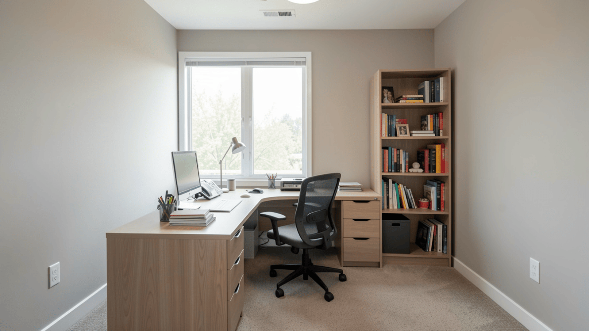
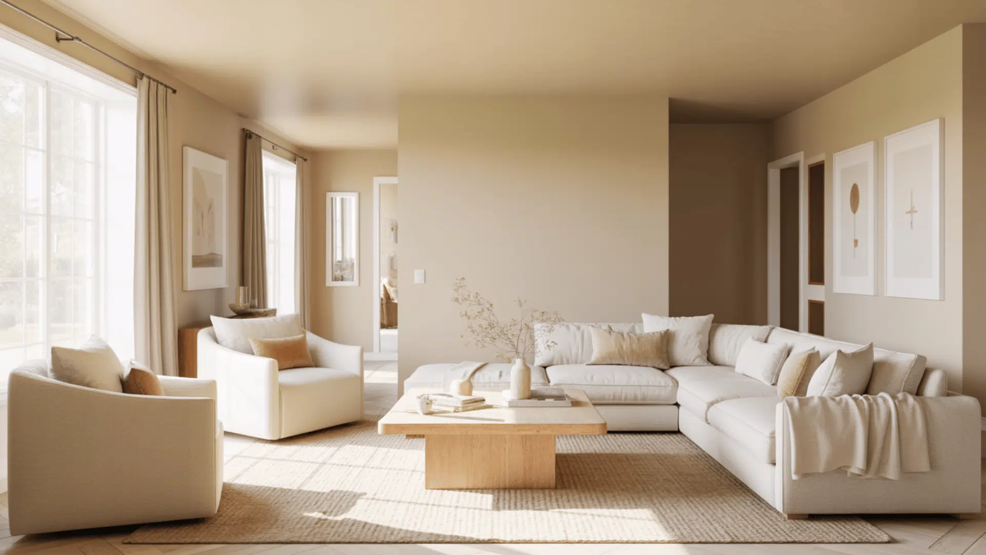
1. Living Rooms
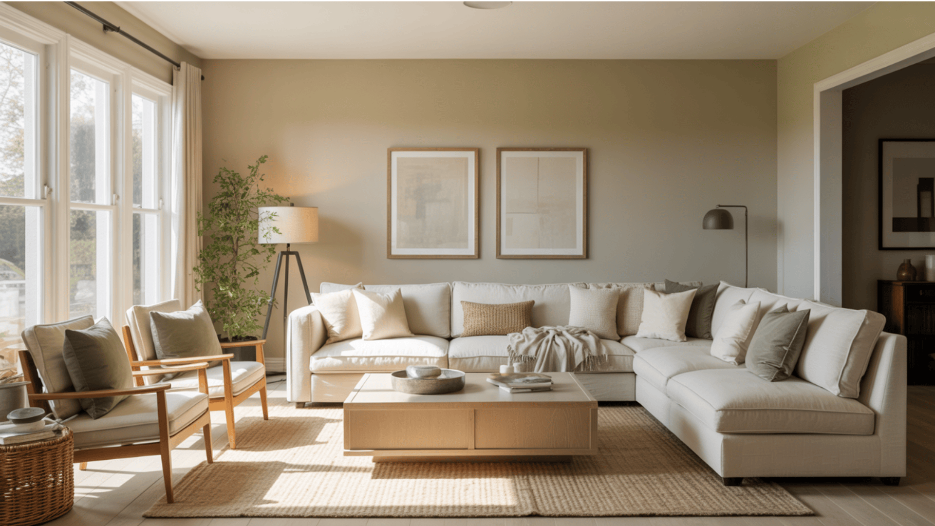
Pale Oak creates a calm, welcoming atmosphere in living spaces. It’s one of those colors that lets furniture and decor breathe. It works beautifully behind both modern and traditional pieces, and it doesn’t compete with art or textiles.
It also pairs well with wood accents, especially those slightly muted, natural finishes. I’ve used it in living rooms where the client wanted “warm but not beige,” and it delivered every time.
2. Bedrooms
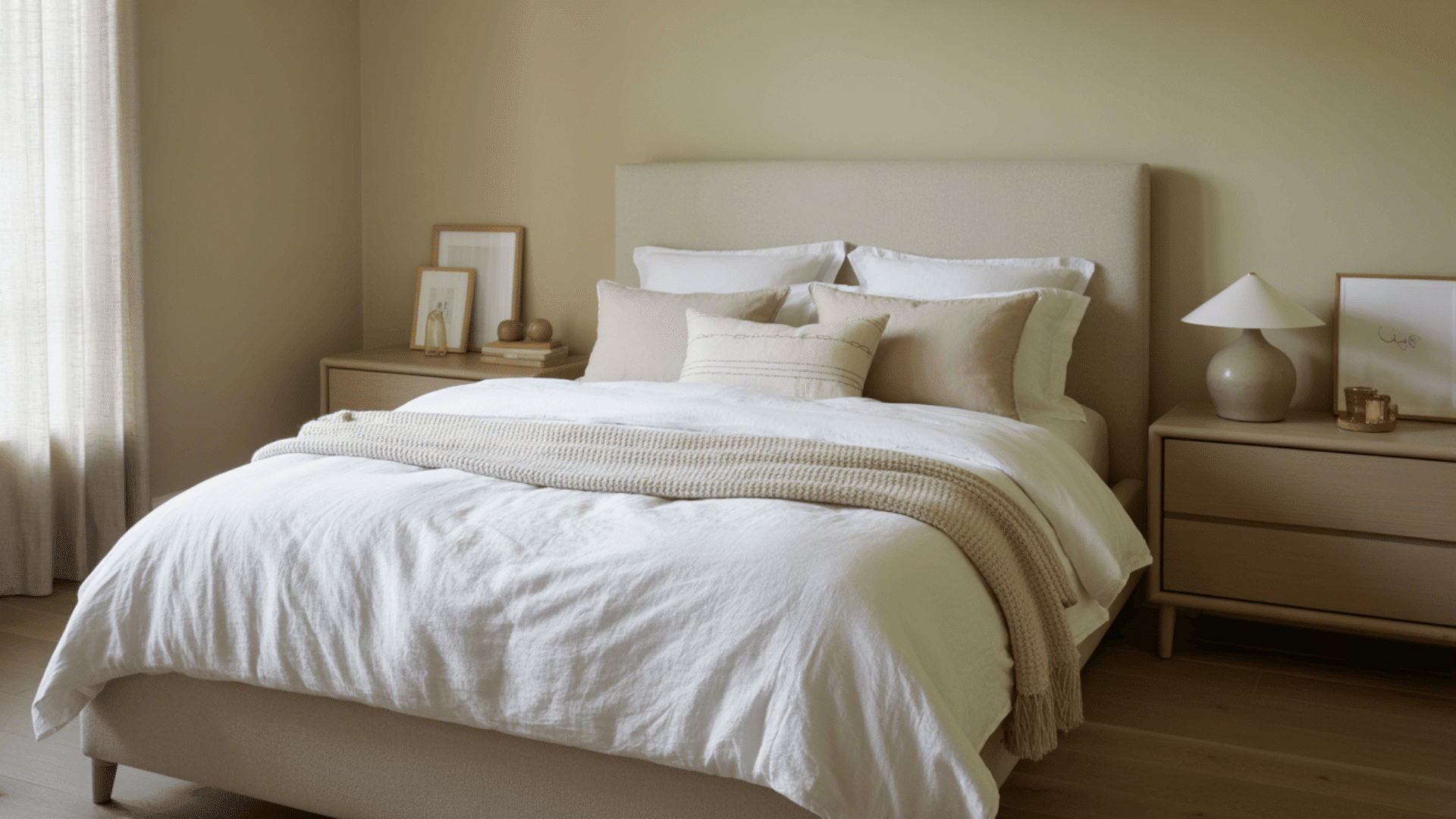
This is one of my favorite rooms for Pale Oak because it brings a soft warmth without feeling heavy. Bedrooms need a calm, restful tone, and Pale Oak reads like a cozy neutral that still feels clean.
It looks beautiful with white bedding, layered linens, and both light and dark furniture. The morning light keeps it fresh, while evening light makes it feel comforting, like the room is settling down with you.
3. Kitchens
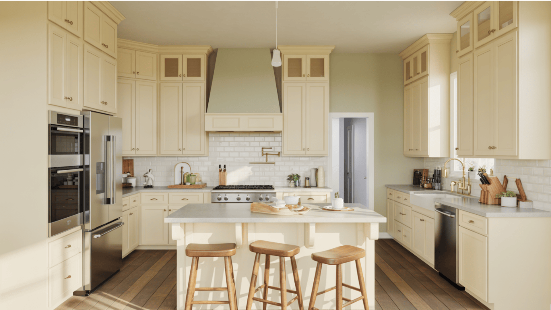
Kitchens come alive with Pale Oak on the walls, especially when white cabinets are involved. It creates contrast without feeling too strong.
It also works with stainless steel appliances, tile backsplashes, and most stone countertops without clashing. It also hides minor wall imperfections better than a bright white, which is a quiet win.
4. Bathrooms
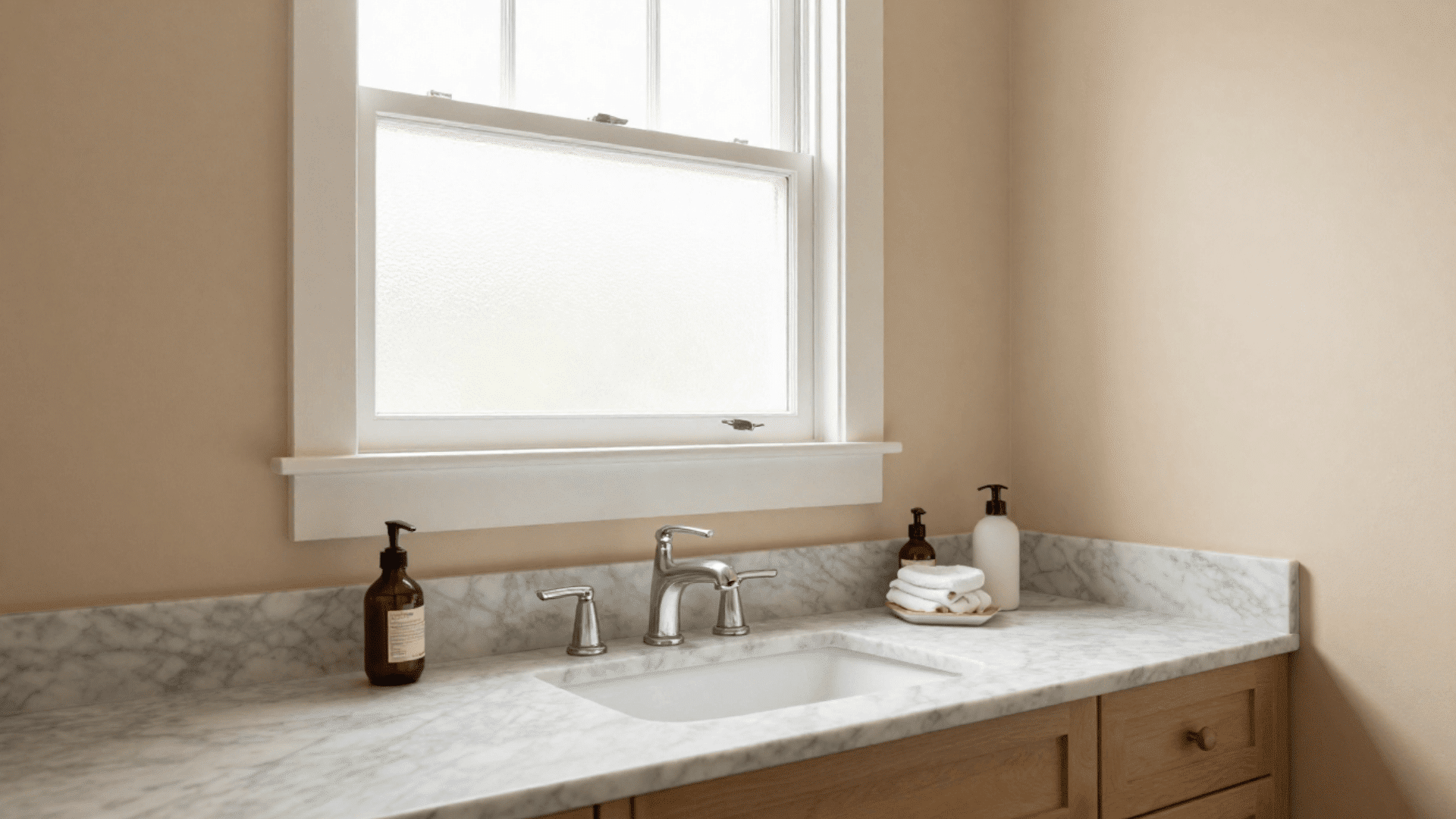
Bathrooms are where Pale Oak gives off a clean, spa-like feel without being sterile. White bathrooms can sometimes feel cold, but Pale Oak keeps things warm while still looking fresh.
It works especially well with wood vanities, soft stone, neutral tile, and matte black accents. I’ve used it in both small powder rooms and large primary baths, and it creates a calm, intentional backdrop.
5. Open Concept Spaces
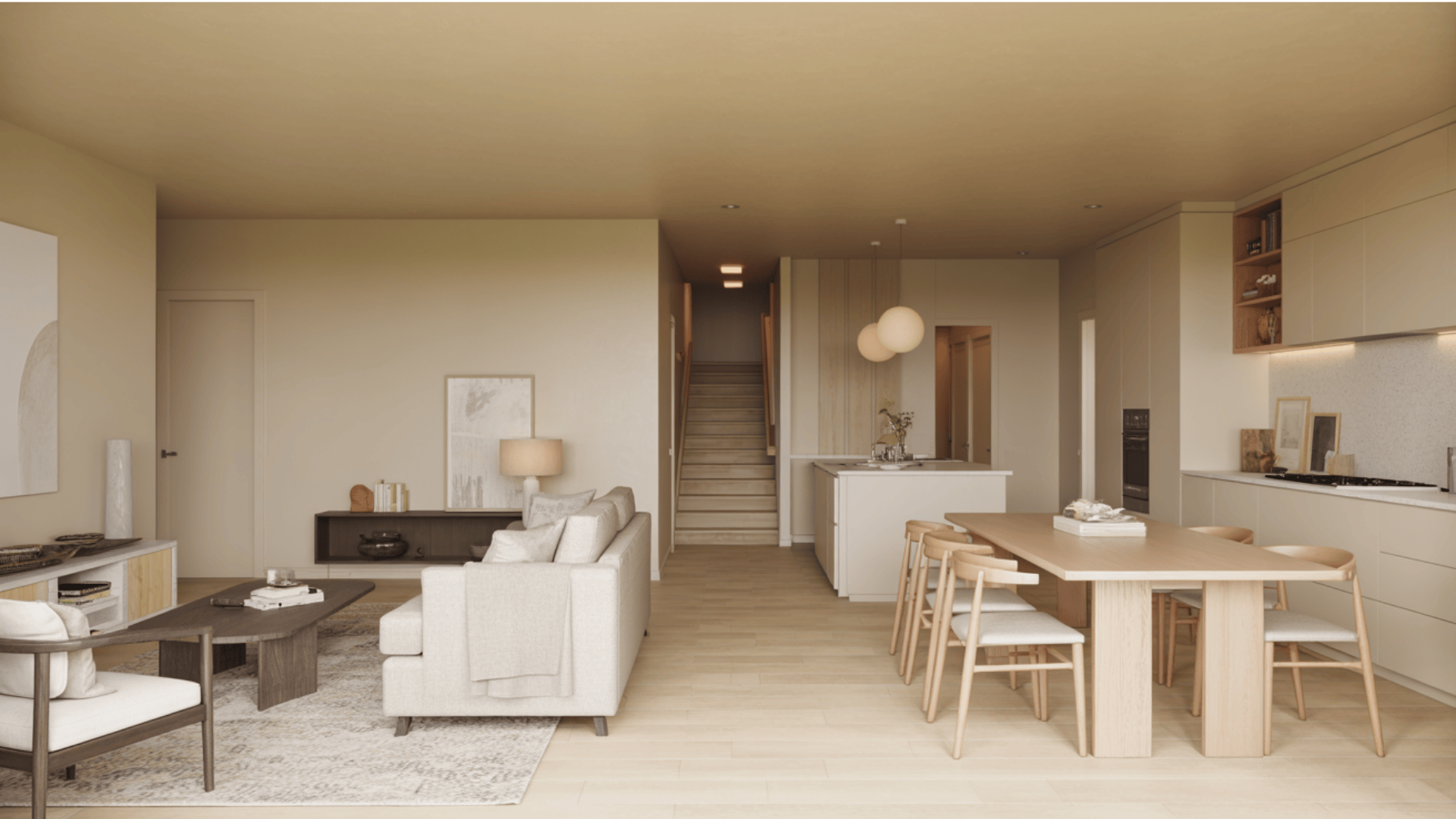
Open layouts are where Pale Oak really earns its reputation. It flows gracefully from one area to another, creating continuity without making it look like you played it too safe.
A big, open-concept space often has multiple lighting zones: one corner bright, another shadowy, and Pale Oak adapts surprisingly well to those shifts. It ties together kitchens, dining areas, and living rooms without making the entire home feel monotone.
6. Hallways and Entryways
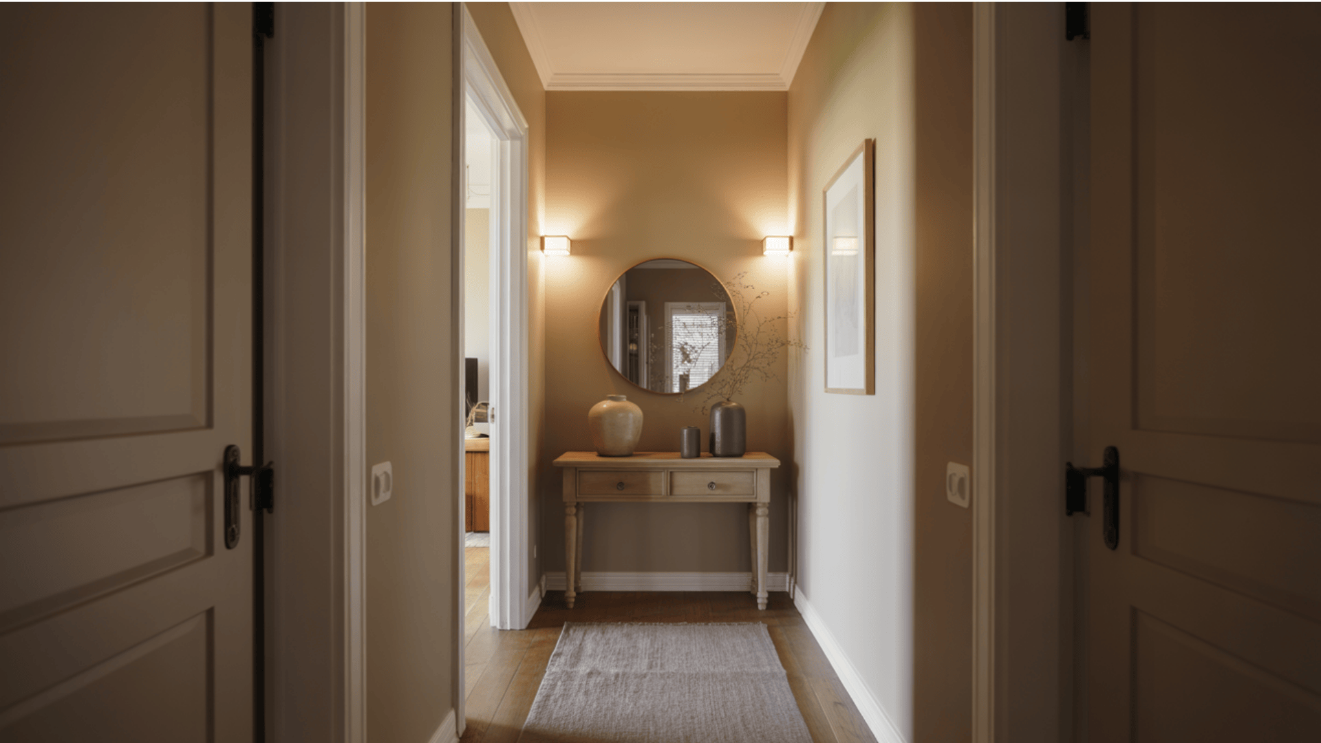
Hallways can be tricky because they often lack natural light. Pale Oak usually handles this better than many pale neutrals because it still retains warmth. It brightens narrow spaces and creates a welcoming first impression in entryways.
It also works as a “bridge” color, perfect for connecting rooms with different paint colors without creating harsh transitions.
The adaptability of Pale Oak across different rooms is what makes it a designer favorite. Whether someone paints the entire home or just select spaces, this color delivers consistency and warmth.
How to Test Pale Oak Before You Commit
Nobody wants to paint a whole room and realize the color looks completely different from what was expected. Pale Oak is a color you have to test properly.
- Get sample pots, not just paint chips: Paint chips are wildly misleading under store lighting. A real sample on your wall will show the undertones and how the color shifts throughout the day.
- Paint large poster boards: Go bigger than you think, at least two square feet per sample. Tiny swatches don’t show how a color behaves across a full wall.
- Testing on multiple walls is non-negotiable for Pale Oak. It can look different on each wall based on exposure and light direction. I suggest painting at least two opposite walls so you can compare.
- Live with it for several days: Watch it from morning to night and in different weather. Pale Oak can feel totally different on a sunny day versus a cloudy one.
- Compare it to existing elements: hold it up against flooring, trim, countertops, and furniture. This is where undertone clashes show up, especially with warm woods or orange-toned floors.
How People Pair Pale Oak with Wood, Floors, and Tile
Pairing Pale Oak with the right materials is what makes it feel intentional and high-end. The wrong combo can bring out undertones you didn’t even notice before.
| Category | Best Pairings | What to Avoid |
|---|---|---|
| Wood Tones & Finishes | Walnut, oak with gray undertones, natural maple, and light birch woods | Cherry wood and mahogany, the pink and red tones clash with Pale Oak’s green undertones |
| Flooring Types | Gray-toned hardwood, light oak, greige LVP, and neutral tile | Honey oak or golden bamboo orange-toned flooring creates an unflattering contrast |
| Stone & Tile | Marble, white subway tile, gray quartz, and neutral travertine | Warm terra cotta or rust tiles with orange undertones fight with the greige paint color |
| Fabric Undertones | Cool beiges, soft grays, creams, and fabrics with green or blue undertones | Orange or peach fabrics; these warm tones bring out unwanted green notes in the paint |
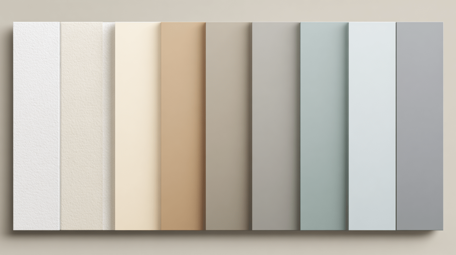
Best Coordinating Colors and Trim Options for Pale Oak
Benjamin Moore Pale Oak plays well with others, but some color combinations work better than others. Choosing the right trim colors and coordinating shades makes the whole space feel pulled together.
Perfect Trim Colors
- Simply White (OC-117)
- Chantilly Lace (OC-65)
- White Dove (OC-17)
- Decorator’s White (OC-149)
Coordinating Wall Colors
- Revere Pewter (HC-172)
- Balboa Mist (OC-27)
- Gray Owl (OC-52)
- Hale Navy (HC-154)
- Hunter Green (2041-10)
Color Palette Ideas
- Quiet Moments (1563) – soft blue
- October Mist (1495) – sage green
- Wrought Iron (2121-10) – deep charcoal
- Kendall Charcoal (HC-166) – moody gray
- Sandy Hook Gray (HC-108) – warm taupe
Whether you want something monochromatic or you want contrast, Pale Oak gives you a really flexible base to build from. The key is always testing the combos in your light.
How Benjamin Moore Pale Oak Compares to Popular Neutrals
Pale Oak is often compared to other “can’t-go-wrong” neutrals, so I like to explain the differences in a simple, quick, and practical way.
| Paint Color | How It Compares to Pale Oak |
|---|---|
| Revere Pewter (HC-172) | Cooler and grayer overall. Less beige warmth, more true gray with subtle green undertones. Works better in rooms with lots of natural light. |
| Edgecomb Gray (HC-173) | Warmer and more beige-leaning. Has yellow undertones instead of green, creating a cozier feel but less adaptable in modern spaces. |
| Balboa Mist (OC-27) | Lighter with an LRV of 74. More airy and less grounded. Better for small rooms needing brightness, while Pale Oak anchors larger spaces. |
| Agreeable Gray (SW 7029) | Sherwin-Williams’ version leans warmer with stronger beige notes. Less green undertones, making it feel slightly more traditional than this greige paint color. |
What People Think About Benjamin Moore Pale Oak
Pale Oak is widely loved as a soft, light greige that feels warm and relaxed. Most people describe it as “easy” in bright spaces, neutral without being cold, warm without being yellow. But it can surprise people, too.
In cooler light or in shadowy corners, it may read slightly lavender-leaning or purplish-taupe, which can catch some homeowners off guard. I’ve seen this happen most often in north-facing rooms or spaces with cooler flooring.
On the other hand, near warm woods and creamy trim, it tends to look smoother and more beige. That’s why the biggest takeaway is always the same: Pale Oak is beautiful, but it’s lighting-dependent. Test it before you commit.
Final Thoughts
Choosing a paint color doesn’t have to feel overwhelming, and Benjamin Moore Pale Oak makes it easier in a lot of homes. It’s flexible, classy, and capable of working across multiple rooms without looking boring.
It’s not perfect for every space, but when the conditions are right, Pale Oak delivers that warm, welcoming look people crave, especially if they want a neutral that still feels special.
The real secret is testing it properly, paying attention to undertones, and pairing it with finishes that bring out its best side. In the right setting, Benjamin Moore Pale Oak doesn’t just paint the walls, it changes the entire feel of the home.
Ready to try it? Grab a few sample pots, paint big boards, and watch how it shifts throughout the day. It might be exactly what your walls have been waiting for.