Looking for a paint color that feels calm, fresh, and works in almost any room? Benjamin Moore Santorini Blue might be exactly what you need.
I’ve seen how this soft blue-gray creates peaceful spaces that feel open and relaxing.
It’s not too bold or too quiet – it sits right in that perfect middle spot. From bedrooms to bathrooms, this color adapts beautifully to different lighting and styles.
The medium tone keeps rooms feeling bright without being overwhelming. If you want a color that brings a coastal, serene feeling to your home, keep reading to see how this shade performs in real spaces.
What Exactly is Santorini Blue?
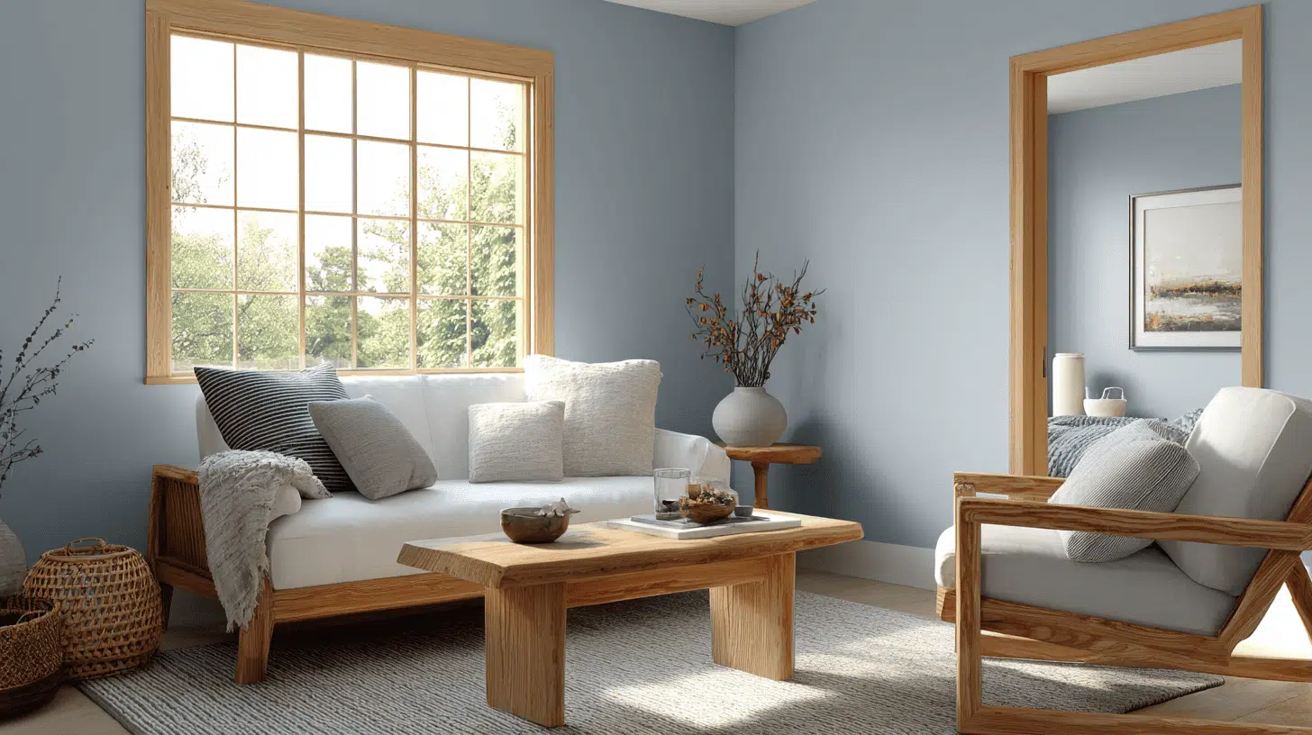
Santorini Blue by Benjamin Moore is a medium blue with clear gray undertones, giving it a calm, slightly muted look. It is not a bright or bold blue, and that makes it easier on the eyes.
The Light Reflectance Value (LRV) is around 44, meaning it reflects a moderate amount of light and does not feel too dark or too washed out. The commonly listed hex code is #5B7C8B, with RGB values close to 91, 124, and 139.
Within the Benjamin Moore blue family, Santorini Blue sits between deeper navy shades and softer coastal blues, offering a balanced option compared to colors like Hale Navy or Palladian Blue.
Benjamin Moore Santorini Blue: How It Really Looks in Homes?
When I see Santorini Blue on real walls, the first thing that stands out is how soft and beach-style it feels. It reads as a calm blue rather than a bright one, which makes rooms feel relaxed.
I’ve noticed that lighting plays a big role in how it shows up. In cooler or shaded light, the gray undertone becomes stronger, and the color feels quieter.
In warmer light, it looks a bit fresher and more open without turning bold.
Many people share that it creates a calm, airy feeling, especially in bedrooms and living rooms. I also find that it works well in both small and large spaces, helping rooms feel easy and comfortable rather than heavy.
How Lighting Affects Santorini Blue?
Lighting plays a big role in how Santorini Blue looks on the walls. I’ve noticed that the color can shift throughout the day and change depending on room size and lighting type. Understanding these changes helps avoid surprises after painting.
- North-Facing Rooms: The color looks cooler and more gray because there is less direct sunlight.
- South-Facing Rooms: Strong natural light makes the blue look clearer and slightly brighter.
- LED vs Incandescent Bulbs: Cool LED lights can make the paint look dull, while warm bulbs make it feel softer.
- Small vs Large Rooms: In small rooms, it helps the space feel open. In large rooms, it stays calm and even.
After seeing it under different lighting, I recommend testing Santorini Blue on small sections of multiple walls. Check it at different times of day, with the lights on and off, to see how it feels in the room.
Best Rooms for Santorini Blue – Where It Shines
Santorini Blue works well in many areas of the home because of its soft, calming tone. It can create peaceful bedrooms, fresh bathrooms, and inviting living spaces.
The color pairs well with both light and dark furniture and adapts to various lighting conditions.
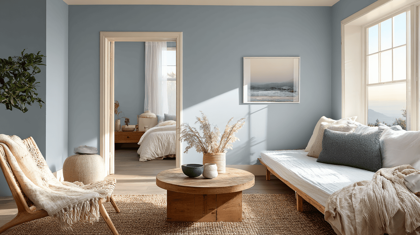
1. Bedroom: Calming Vibe
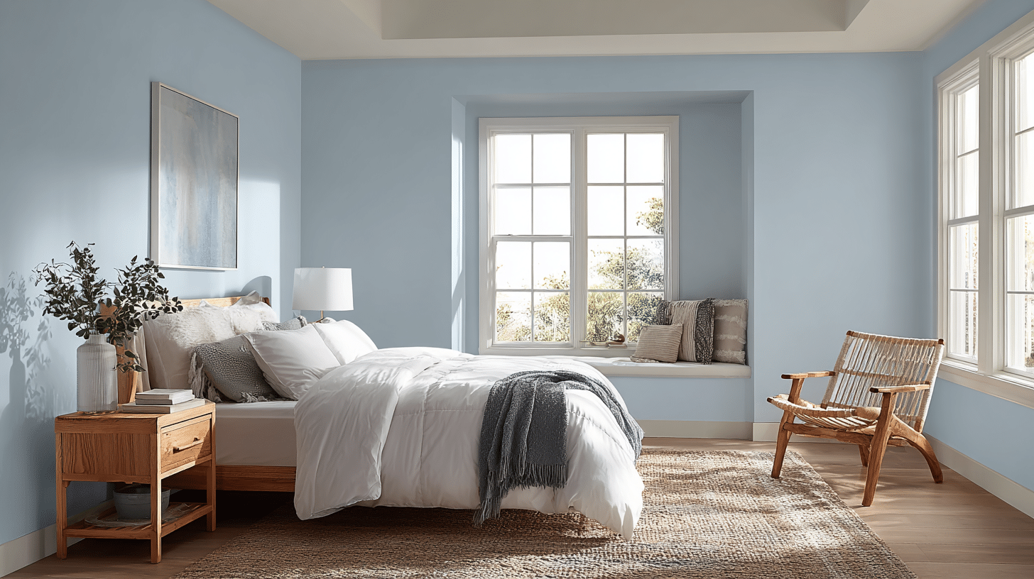
Santorini Blue is ideal for a bedroom because it creates a soft, peaceful atmosphere. The gray undertones help the walls feel calm, making the space more restful. Paired with white bedding or light wood furniture, the room feels airy and open.
In smaller bedrooms, the color keeps the space from feeling cramped, and in larger rooms, it provides a soothing backdrop for art, decor, and furniture arrangements.
2. Living Room: Bright and Inviting
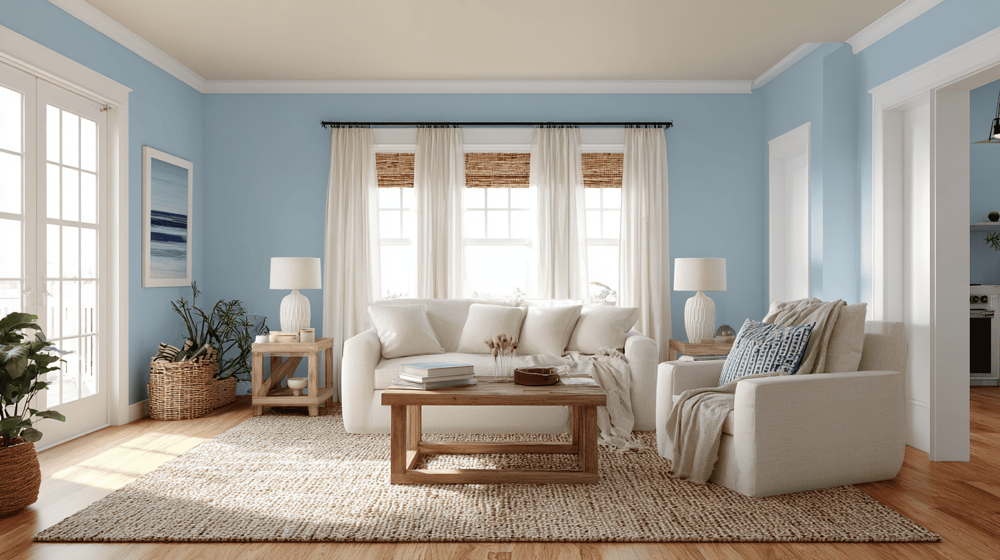
In living rooms, Santorini Blue provides a welcoming, open feeling without being too strong. It works well with neutral furniture and natural wood tones.
The color makes the space bright by day and cozy at night with warm lighting. Adding pillows, rugs, or curtains in soft creams or sandy tones balances the room and creates a comfortable space for relaxing or hosting guests.
3. Kitchen: Pairs with White Cabinets
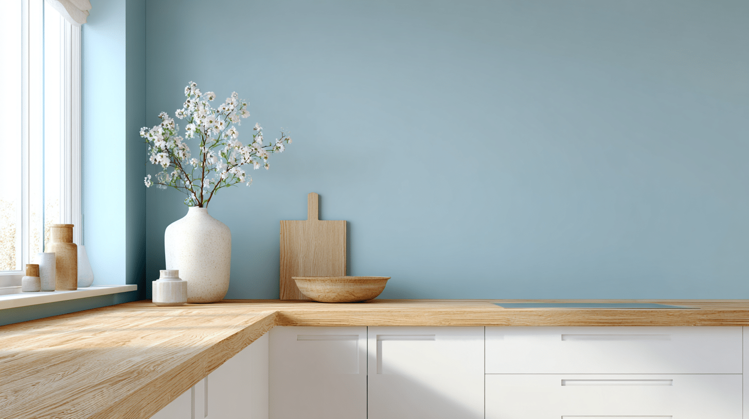
This color works well in kitchens, especially with white cabinets, creating a soft contrast that keeps the space bright and open. It complements stainless steel appliances or light wood countertops.
When choosing a calming shade like Benjamin Moore Santorini Blue, it’s also worth considering the best paint finish for cabinets and built-ins. The right finish can impact the sheen and how the color reads in your space.
4. Bathroom/Spa Feel: Clean & Fresh
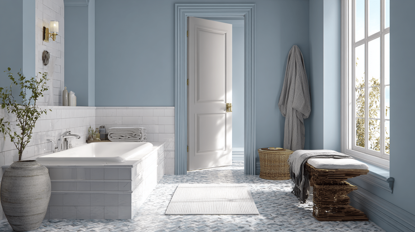
Santorini Blue is perfect for bathrooms because it creates a clean, fresh look reminiscent of a spa. The soft mix of blue and gray reflects light, making smaller bathrooms appear larger.
It pairs beautifully with white tiles, light wood, or marble accents. Even simple accessories, like white or gray towels and rugs, stand out against the walls while keeping the overall feel calm and peaceful.
What Colors Go With Santorini Blue – Best Pairing Ideas
Santorini Blue pairs well with a range of wall, trim, and accent colors. Choosing the right combinations can make the color feel balanced and bring out its soft, calming tone.
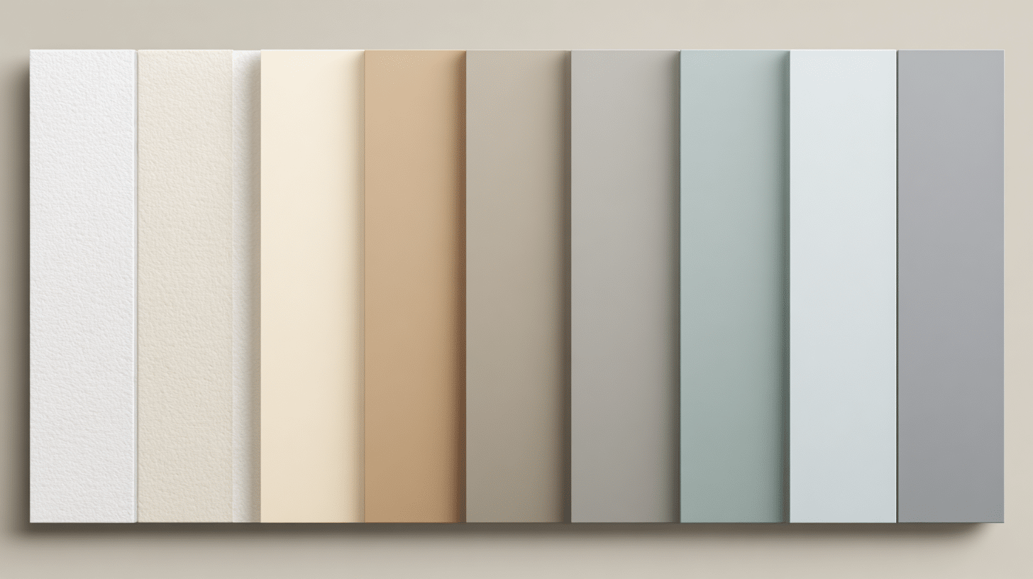
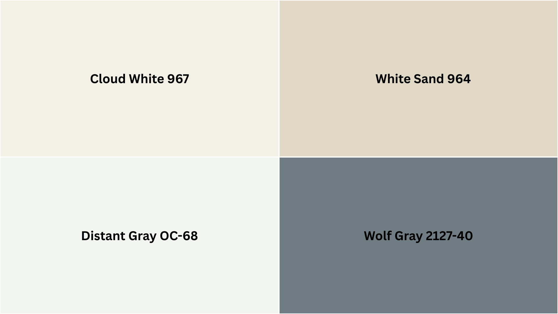
Complementary Trim Colors:
- Cloud White: A clean, crisp white that brightens the space and highlights the blue.
- White Sand: A warmer white that adds a subtle softness and works well in cozy rooms.
- Distant Gray: A muted gray that complements the gray undertones in Santorini Blue.
- Wolf Gray: A darker gray for a more dramatic contrast that still feels balanced.
Using these trim colors helps define the space while keeping the overall look calm and inviting. Light accessories or furniture in similar neutral shades can tie the room together beautifully.
Pros & Cons of Santorini Blue
Santorini Blue has a soft, calming tone that works in many spaces, but it may not be perfect for every room. Reviewing its main advantages and drawbacks can help make a better choice before painting.
| Pros | Cons |
|---|---|
| Creates a calm, relaxing atmosphere | Can look gray in low light |
| Works with many interior styles | Might feel too cool for warm color schemes |
| Medium LRV keeps rooms feeling open | Not bold enough for a statement wall |
| Pairs well with white, gray, and wood tones | Can appear dull under cool artificial lighting |
| Soft enough for small and large spaces | May not suit rooms needing strong, energetic colors |
Overall, Santorini Blue is a reliable choice for bedrooms, living areas, and bathrooms where a peaceful, open feel is wanted. Checking the color in different lighting conditions ensures it looks right for the space.
Common Mistakes With Santorini Blue
Santorini Blue is a beautiful color, but it can look different depending on how it is used. Avoiding common mistakes helps ensure the color looks its best in any room.
- Ignore Lighting Tests: Always check the color in both natural and artificial light before painting the entire wall.
- Wrong Trim Pairing: Pairing it with very warm or bright trim can clash with the soft blue-gray tones.
- Overusing in Tiny Spaces: Using it on all walls in a small room can make the space feel cooler or smaller.
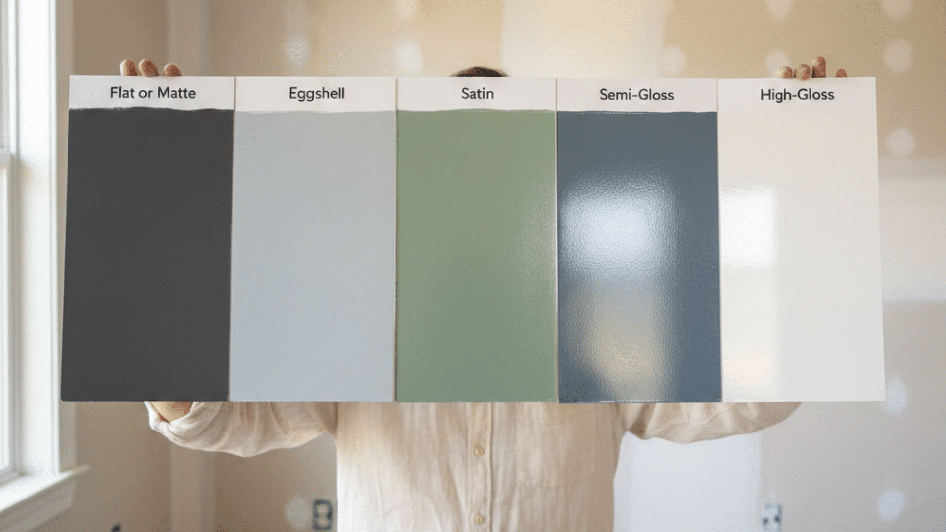
- Choosing the Wrong Finish: Matte or flat finishes can make the color look darker, while satin or eggshell keeps it soft.
- Not Testing with Furniture: The color can look different next to dark or bold furniture, so test samples nearby.
By paying attention to these points, Santorini Blue can create calm and inviting rooms that look exactly as expected. Testing samples and observing the color in different lighting ensures the final result feels just right for the space.
That’s a Wrap
Benjamin Moore Santorini Blue offers a balanced, calming option for anyone wanting a soft blue that feels natural and peaceful.
I find it works best in bedrooms, living rooms, and bathrooms where a relaxed atmosphere matters most. The gray undertones keep it from feeling too bright, while the medium LRV ensures rooms stay open and airy.
Testing the color in your lighting conditions is key to getting the look you want. Pairing it with white or neutral trim completes the calming effect beautifully. Have you used this color in your home?
I’d love to hear your experience – drop a comment below and share how it worked in your space.