Interior design has changed a lot in recent years. Instead of relying on white walls and safe neutrals, many homeowners and designers are choosing color with more confidence and intention. That’s where color drenching comes in.
A color-drenched room uses one shade across the walls, trim, and often the ceiling (and sometimes cabinetry or built-ins), so the space feels unified and personal.
This approach is especially popular as a color-drenching bedroom idea because it can make the room feel calmer, softer, and more restful without requiring much decor.
Depending on the shade, it can also feel bold and full of character. The key is that it’s not just paint everything the same color.
The best results come from considering lighting, how the shade shifts from morning to night, and how texture and paint finish add depth so the room does not feel flat.
What Is a Color-Drenched Room?
A color-drenched room is an interior design approach where a single color saturates every surface in a space.
This means the walls, ceiling, trim, molding, doors, and often the furniture all share the same hue or variations within the same color family.
Rather than using one color as an accent, color drenching makes it the foundation of the entire room.
This technique creates a wrapped, cocooning effect that transforms how we experience interior spaces.
The monochromatic approach eliminates visual breaks, making rooms feel either larger and more open or more intimate and enclosed, depending on the color chosen and the room’s natural light.
How To Choose The Right Color For Color Drenching
Color drenching works when the shade looks good in your room all day, not just in bright daylight.
- Start With What You Can’t Change: Look at floors, tile, counters, and big furniture first. Choose a shade that shares the same undertone (warm or cool) so the room feels pulled together.
- Match The Mood Of The Room: Color drenching makes the mood stronger, so pick with purpose. Bedrooms suit softer tones, living spaces can handle deeper shades, and offices do best with steady colors.
- Test A Large Sample In Real Light: Small chips lie. Paint a large swatch (or use peel-and-stick) and check it in morning and afternoon light, and at night with lamps, so you can see the true shift.
Do these three things, and your color will look intentional all day, not perfect only at one time.
Color-Drenching Interior Ideas
One-color rooms can feel calm, bold, or cozy depending on the shade, lighting, and materials you pair with it. The goal is to let one color set the mood, then build depth through texture and finishes.
Use these styles as starting points and adjust the tone lighter, deeper, warmer, or cooler based on your space.
1. Deep Charcoal Living Room
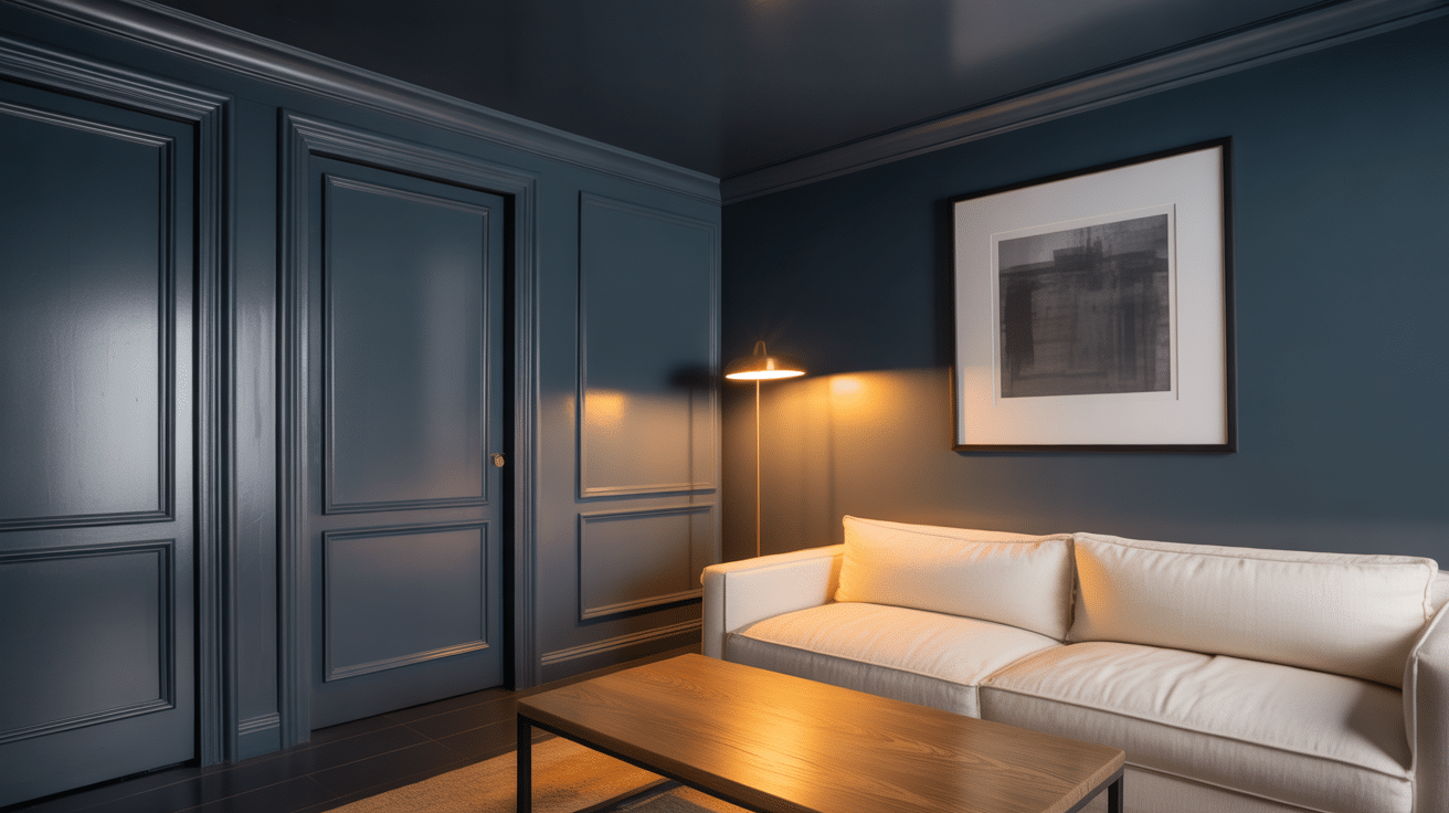
Charcoal turns a living room into a clean, modern backdrop that makes art and furniture stand out. It works especially well when the room gets decent daylight, because light keeps the color from feeling too heavy.
Use a softer wall finish and a slightly shinier trim finish to add subtle dimension to the room. Warm metals and light upholstery help the space feel welcoming at night.
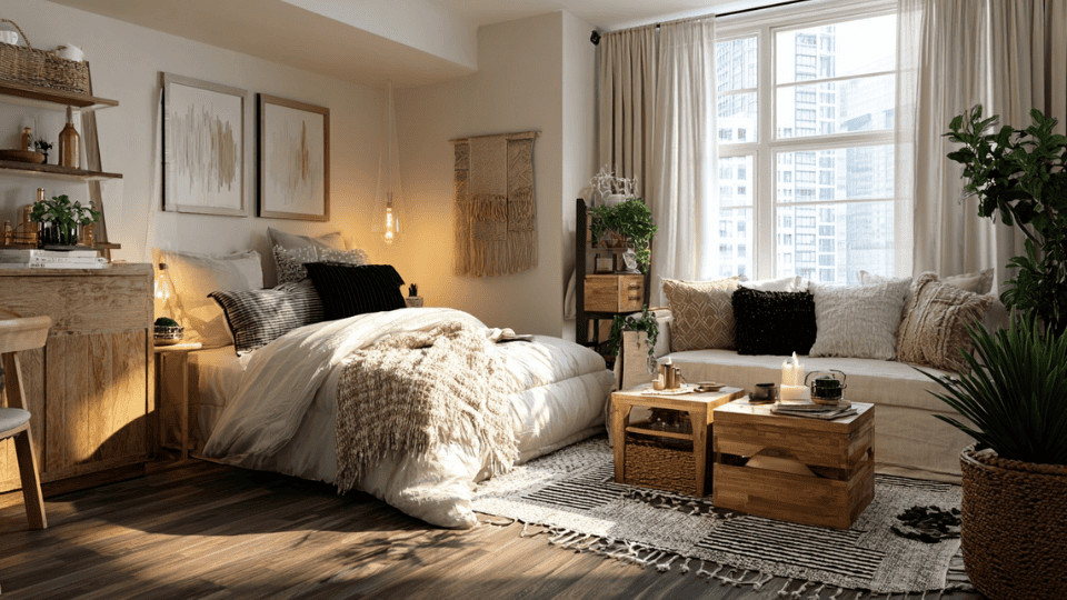
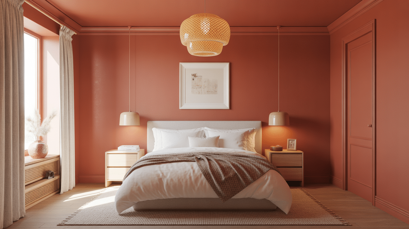
2. Terracotta Bedroom
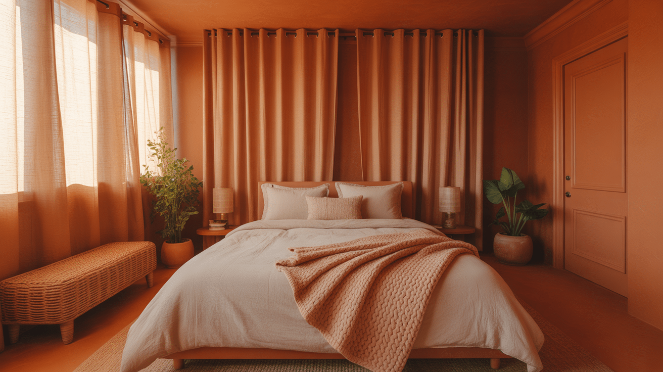
Terracotta brings a warm, sunset-like glow that feels grounded and comforting. It’s a strong choice for bedrooms because it creates warmth even in cooler light.
Keep the look soft with cream bedding and natural textures like linen and woven pieces. Add a few clay or ceramic accents to make the room feel cohesive rather than themed.
3. Sage Green Kitchen
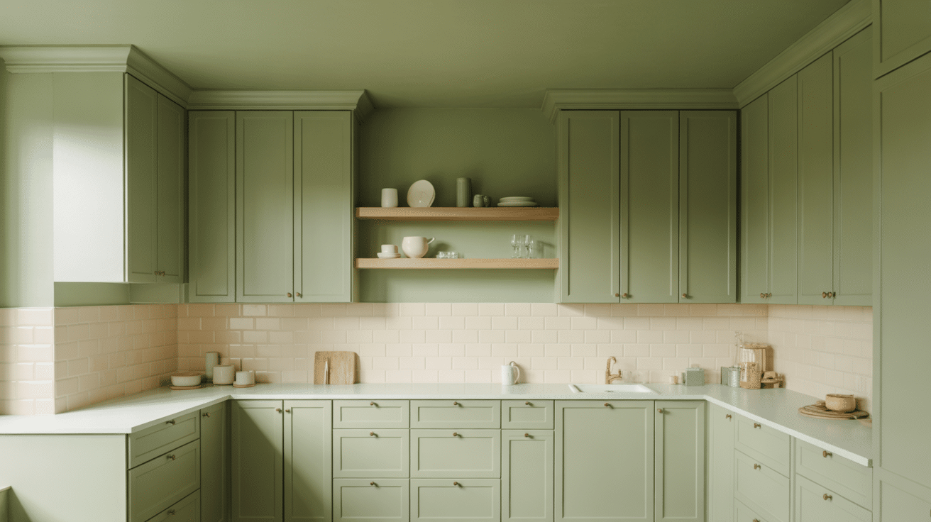
Sage makes kitchens feel calm and organic, especially when used on multiple surfaces. It pairs well with warm woods and light-colored counters, keeping the space balanced.
Small touches like brass hardware can add warmth without adding new colors. If your kitchen is dark, choose a lighter shade of sage to keep it feeling fresh.
4. Dusty Pink Bathroom
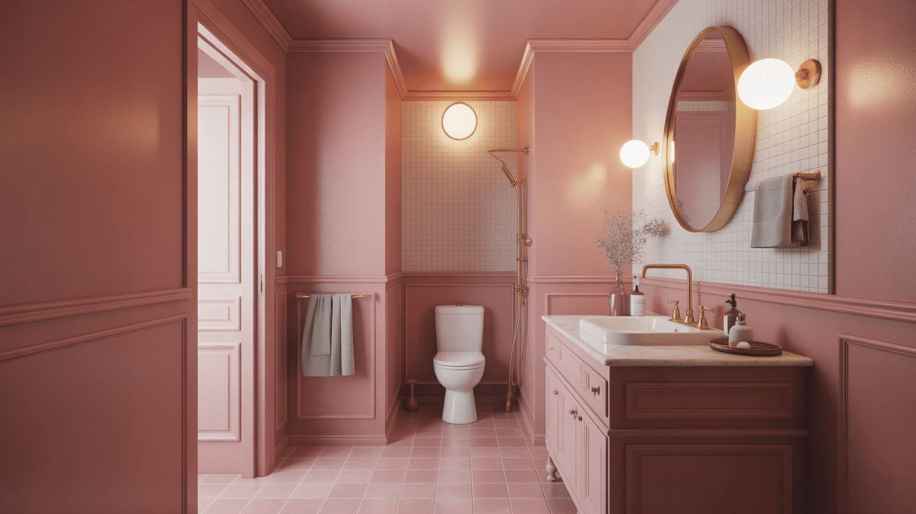
Dusty pink can make a small bathroom feel intentional and cozy rather than plain. It works well in powder rooms because the mood feels special without requiring much decor.
Pair it with brass details and a larger mirror to reflect light. Keep towels and accessories light so the room does not feel overly saturated.
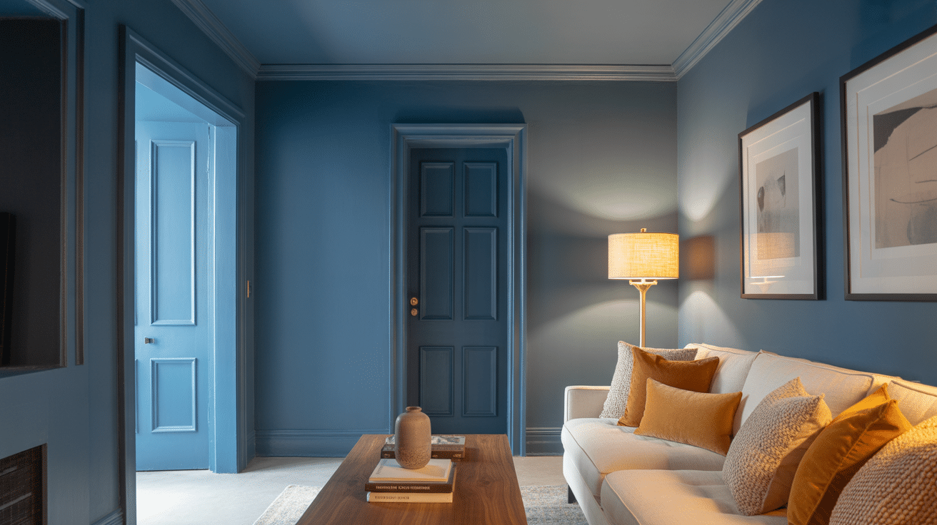
5. Navy Home Office
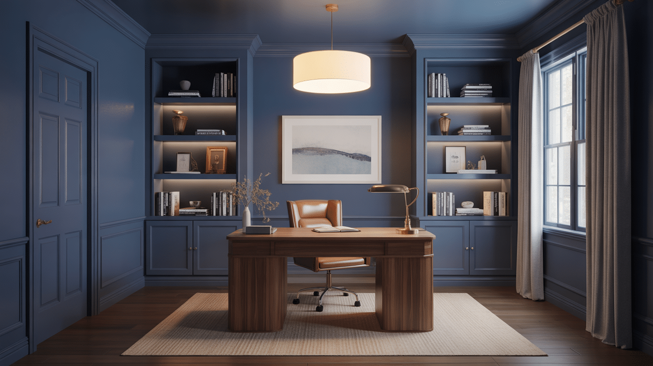
Navy creates a focused, library-like feel that suits workspaces well. It can reduce visual distraction and make a simple office feel more designed.
Warm wood furniture balances the cool tone and keeps it from feeling too formal. Add layered lighting to keep the room comfortable after sunset.
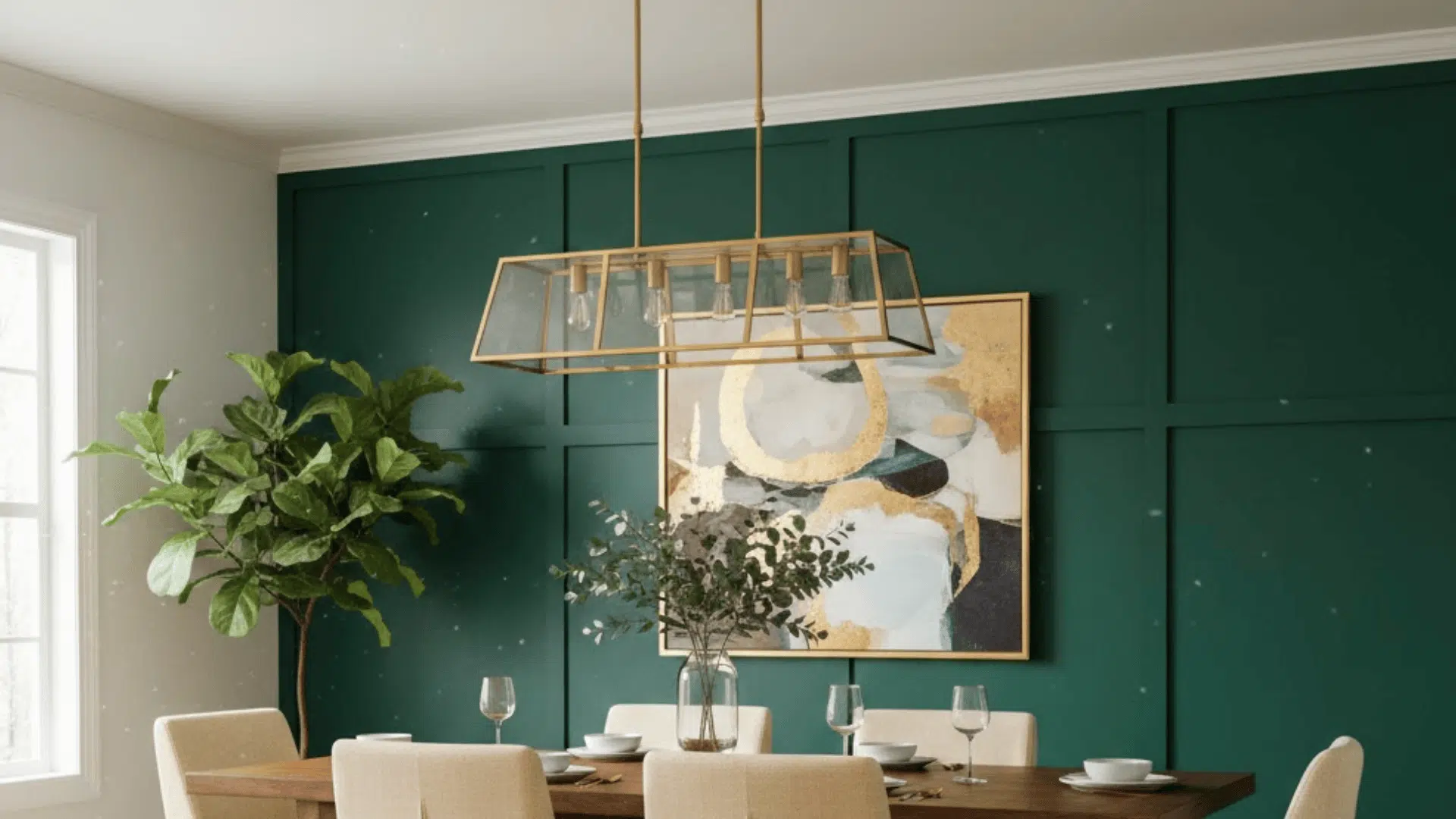
6. Cream Dining Room
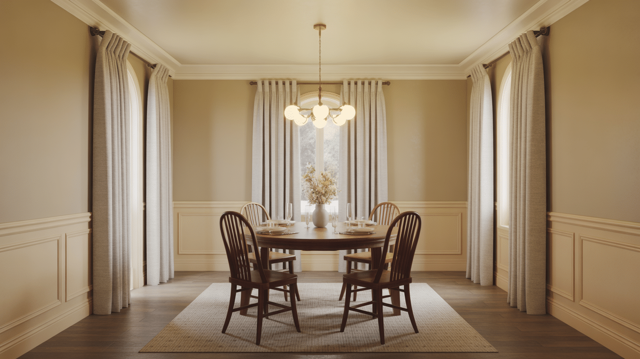
A warm cream drench makes dining rooms feel inviting and softly lit, even during the day. It flatters people and food and keeps the room feeling relaxed.
Texture matters here, so include linen curtains, a woven rug, or a wooden table to add depth. This approach also lets colorful table settings stand out naturally.
7. Forest Green Reading Nook
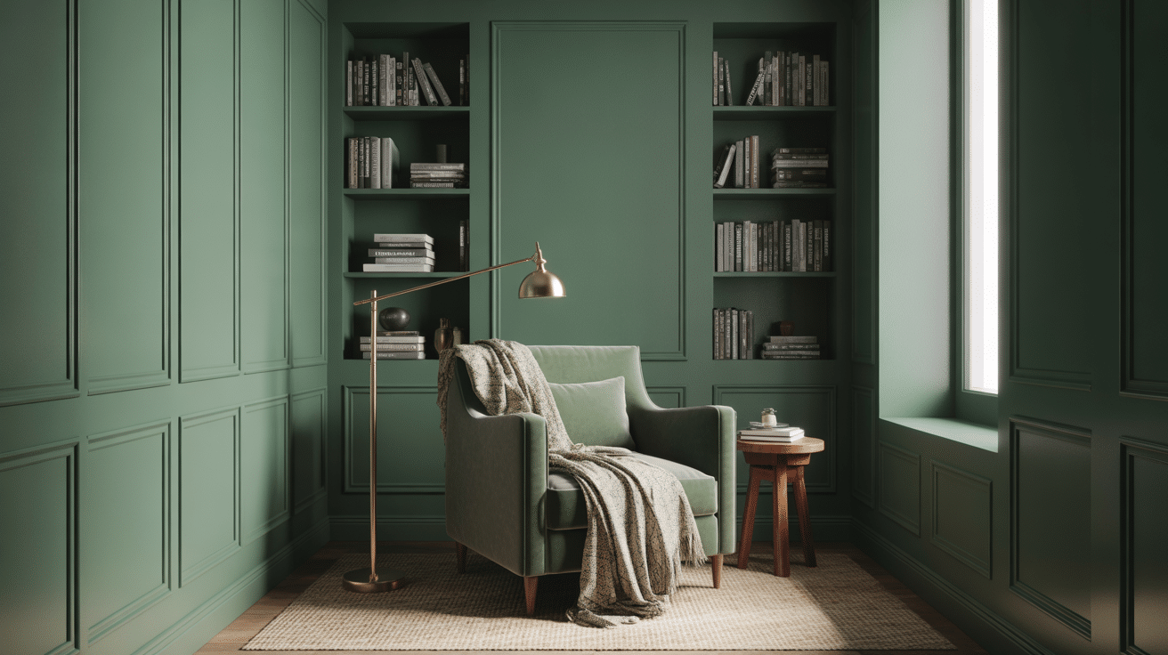
Forest green creates a nook that feels private and snug, perfect for quiet reading time. This color works well in small corners because it creates a sense of intimacy rather than making the area feel cramped.
Add a comfortable chair and a good lamp so the nook feels practical, not just pretty. A soft throw and textured pillow finish the look without adding extra colors.
8. Powder Blue Nursery
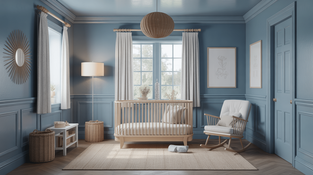
Powder blue creates a calm, gentle feel that suits a nursery without looking overly themed. It works well with both white and natural wood furniture for a clean, soft look.
Texture helps the room feel warm, so add a plush rug and soft curtains. As the child grows, the color still feels flexible for changing decor.
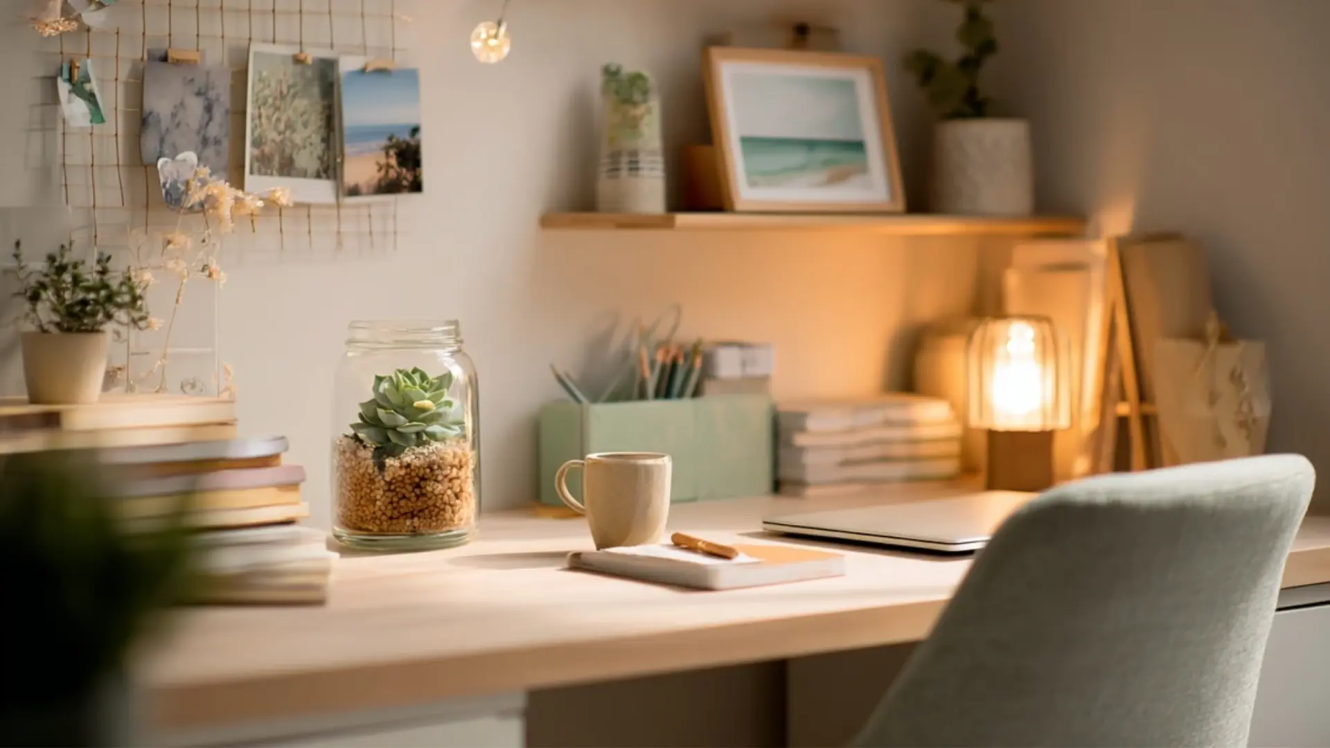
9. Chocolate Brown Study
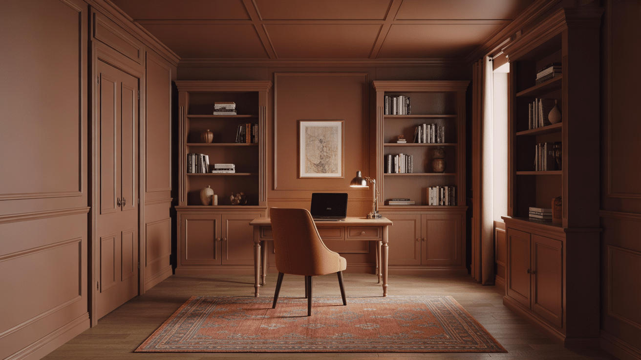
Chocolate brown creates a rich, classic study mood that feels cozy and grounded. It pairs well with leather accents, warm rugs, and wood tones that add depth.
Because darker browns absorb light, good lighting is important for keeping them comfortable. This is a strong choice for reading, writing, or a home library vibe.
10. Pale Gray Entryway
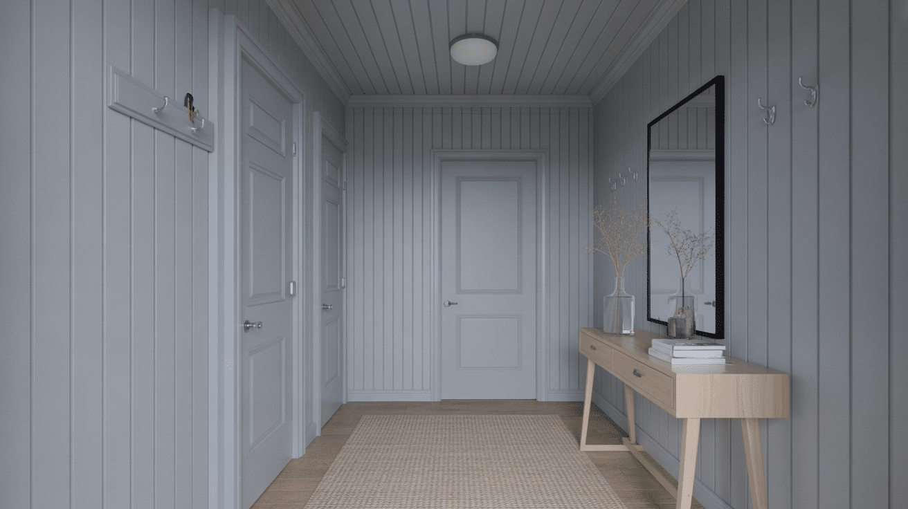
A pale gray entryway feels clean and calm, even when working with many styles in the rest of the house. The monochrome approach can make smaller entry spaces feel more open by reducing visual breaks.
Add a mirror to bounce light and a runner to soften the space. Simple hardware and one strong light fixture complete it.
11. Burnt Orange Guest Bedroom
Burnt orange makes a guest room feel warm and memorable without needing heavy decor. It creates a boutique-hotel mood when paired with crisp white bedding.
Natural wood nightstands and woven textures help it feel relaxed and not too bold. A small lamp and soft rug keep it comfortable for guests.
12. Lavender Bathroom
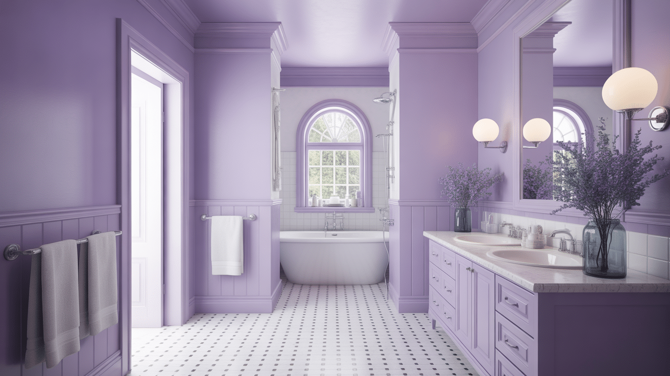
Muted lavender can feel spa-like when it leans soft and slightly gray. It pairs nicely with white towels and clean, cool metal finishes for a fresh look.
Good lighting keeps the color from reading too dark or dull. Add one or two plants for a natural touch that feels calming.
13. Olive Mudroom
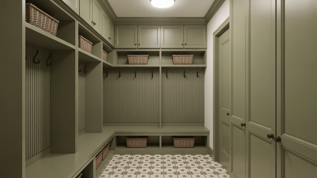
Olive is practical for mudrooms because it hides scuffs while still looking refined. It feels grounded and works well with darker hardware for contrast.
A patterned floor in complementary tones can add interest without changing the wall color story. This is a smart choice for busy homes with kids or pets.
14. Home Gym In Dusty Blue
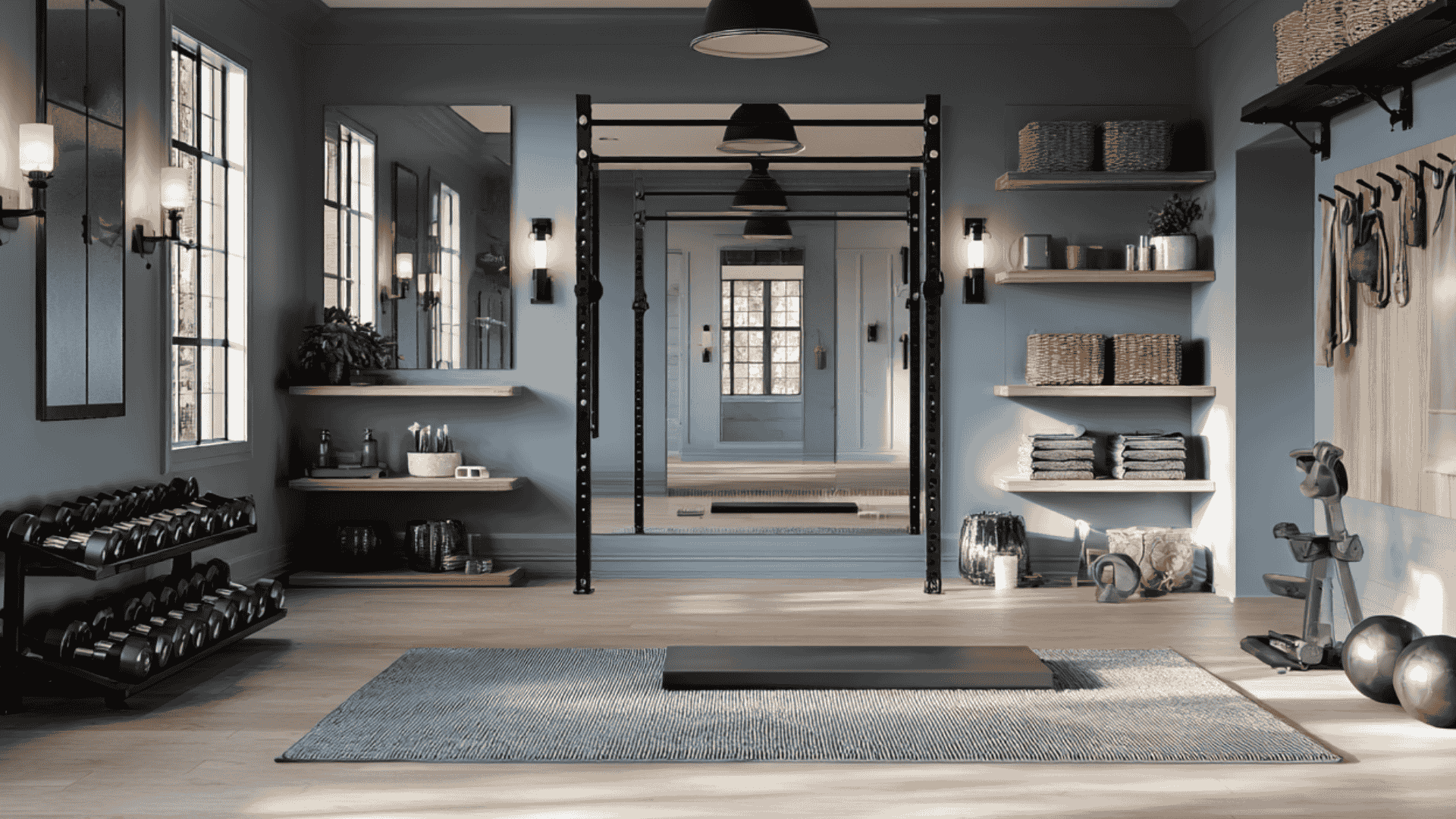
Dusty blue gives a gym space a cool, steady feel that still looks crisp and modern. It pairs really well with mirrors because the soft tone reflects light without feeling stark, so the room feels brighter and more open.
Keep the look grounded with warm wood shelving and woven storage baskets. Add a few black or brushed metal accents (like hooks, dumbbell racks, or light fixtures) to keep it looking sharp and intentional. The overall vibe feels more like a calm wellness room than a busy gym.
15. Slate Blue Primary Bedroom
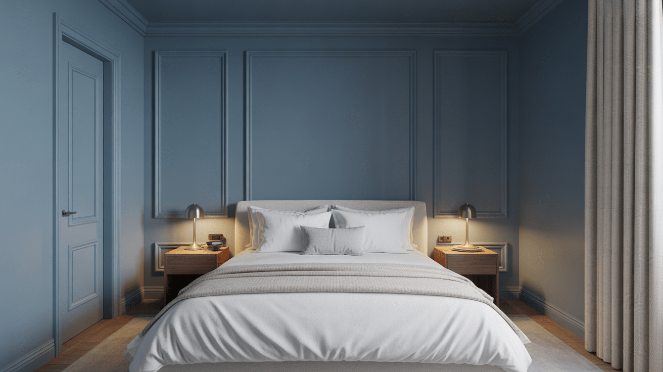
Slate blue feels calm and hotel-like, making it a great fit for a primary bedroom. It looks especially good with layered whites, creams, and textured bedding.
Warm wood furniture helps the room feel balanced and comfortable. Multiple light sources keep the room cozy in the evening.
16. Warm Taupe Media Room
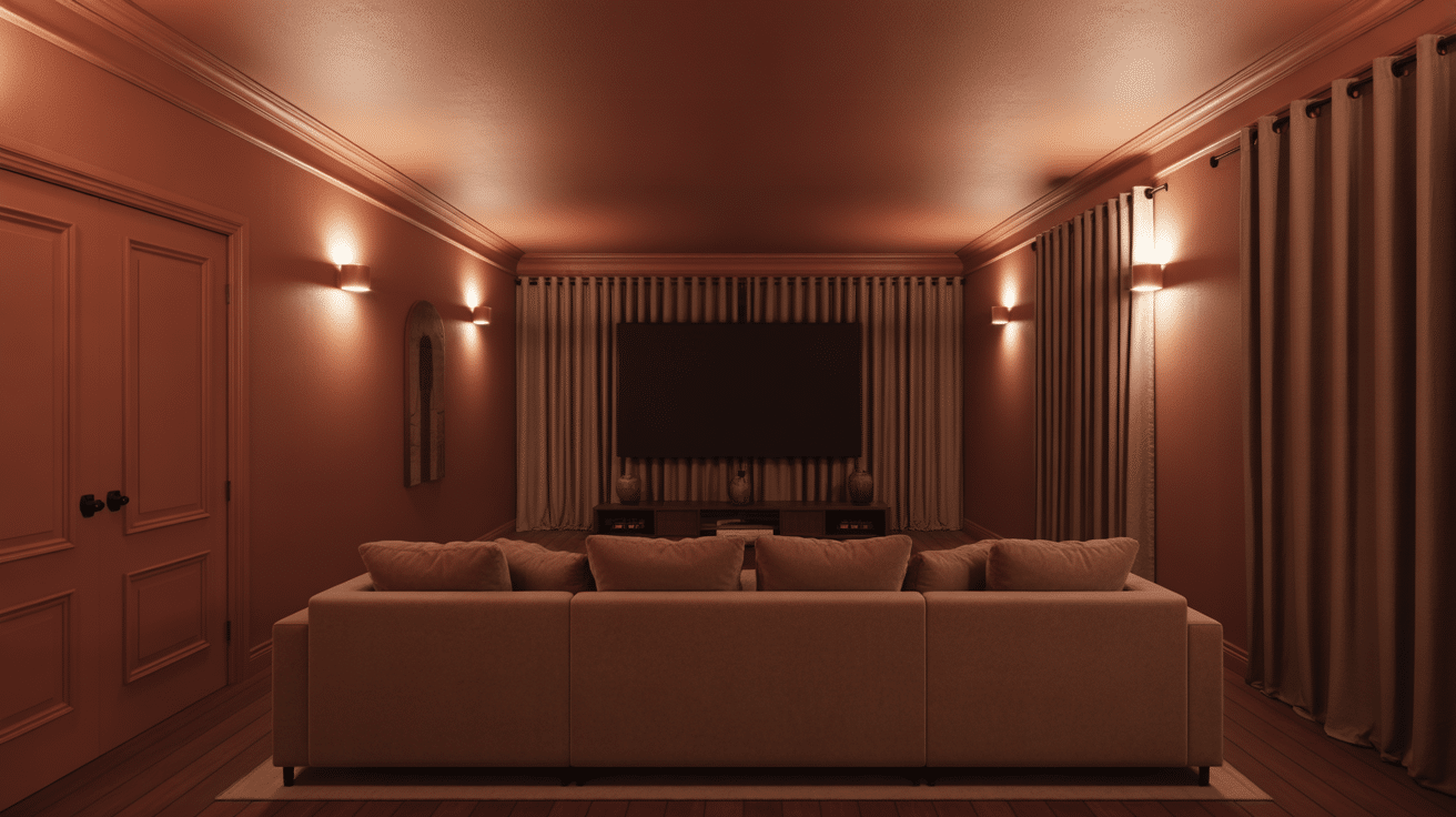
Warm taupe is ideal for media rooms because it reduces glare and feels easy on the eyes. The color absorbs enough light to support screen viewing without going fully black.
Use heavier curtains to control daylight and keep lighting warm and low at night. A soft rug and plush seating finish the theater feel.
17. Mint Green Sunroom
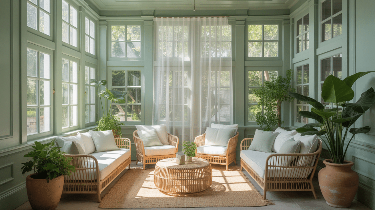
Mint green brings an indoor-outdoor feel that suits sunrooms and enclosed porches. It keeps the space bright while still giving it a clear identity.
Pair it with rattan or wicker furniture and plenty of plants for a natural look. Light textiles keep it airy and comfortable in warmer months.
18. Caramel Home Library
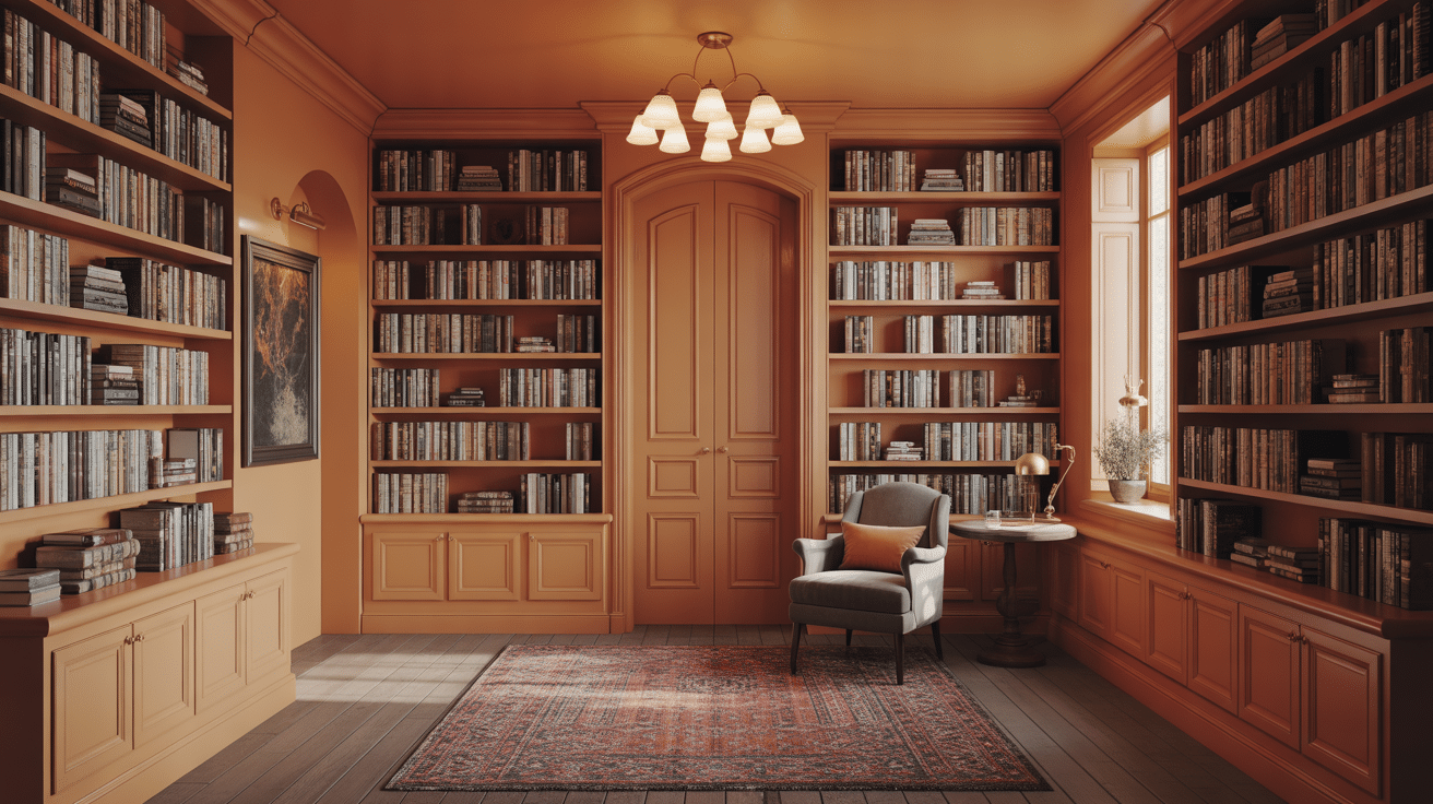
Caramel tones make a library feel warm and inviting while letting books stand out. This shade works well on walls and shelves because it feels cohesive rather than heavy.
Brass or bronze lighting adds warmth and keeps the space readable at night. A comfy chair and textured rug make it feel like a true retreat.
19. Soft White Bedroom
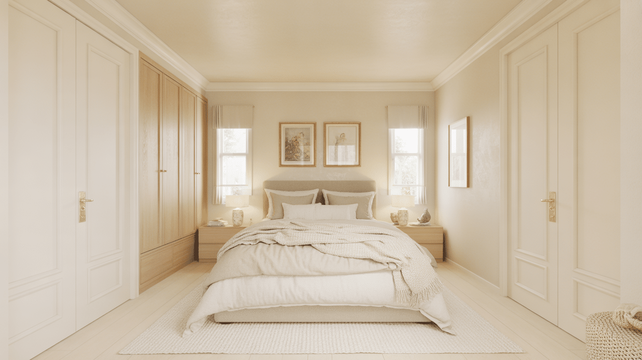
Soft white drenching feels intentional when you focus on texture rather than color contrast. Use varied fabrics, like linen and knits, and layered bedding to give the room depth.
A warm undertone keeps the white from feeling cold. Wood and woven pieces help it feel relaxed and lived-in.
20. Burgundy Powder Room
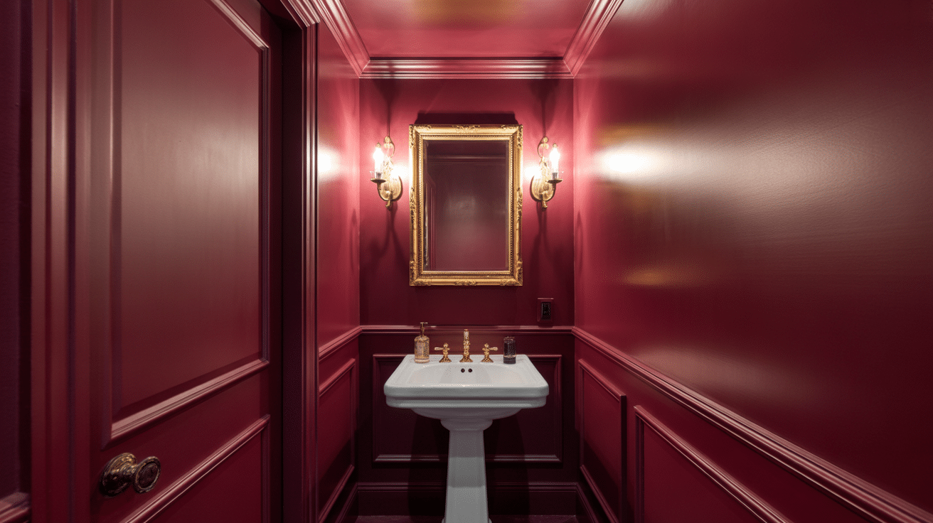
Burgundy creates a strong, jewel-box feel that’s perfect for a small powder room. Good lighting is important so the color feels rich, not gloomy.
Warm metals like brass work beautifully against burgundy and add polish. Keep accessories minimal so the color remains the main feature.
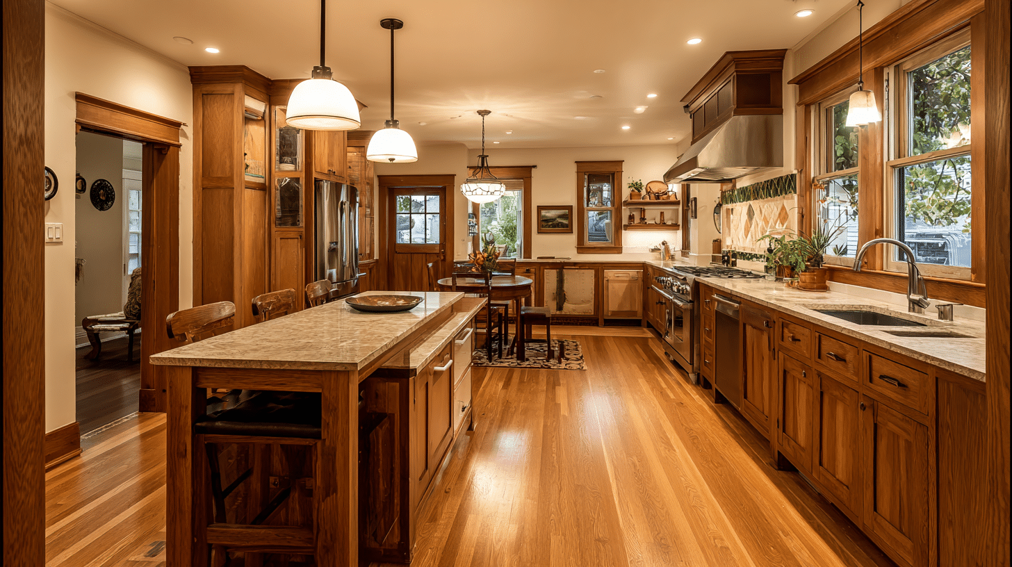
21. Stone Beige Kitchen
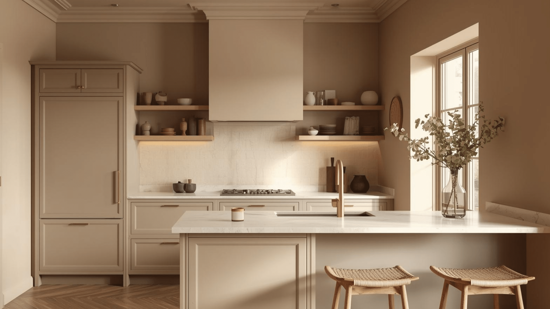
Stone beige is one of my favorite picks for color-drenching a kitchen because it feels warm without looking yellow or dated. It keeps the space bright while still adding more depth than plain white.
I like it with light counters, simple backsplashes, and natural wood shelves or stools for balance. To keep it from feeling flat, add texture, like zellige tile, brushed cabinet fronts, or a soft matte paint finish. Warm metals also pair well.
Do’s And Don’ts For A Room That Feels Right
Use these quick do’s and don’ts to keep color drenching clean, cohesive, and comfortable in real everyday lighting.
| Do’s | Don’ts |
|---|---|
| Do check the undertones in your room. View the color next to floors, tile, and fabrics in both daylight and lamp light. | Don’t assume “gray is gray.” Many grays shift blue, green, or purple once they cover every surface. |
| Do paint the ceiling if you want a true drenched look. It keeps the room feeling wrapped and unified. | Don’t stop at the top of the walls. A white ceiling can break the effect and make the room feel chopped. |
| Do pick a color you’ll enjoy living with. Your daily comfort matters more than what’s trending. | Don’t choose a shade only because it’s popular. Trend colors can feel tiring fast if they’re not you. |
| Do test a large sample first. Paint a large swatch or use peel-and-stick, and check it in the morning, afternoon, and at night. | Don’t rely on tiny paint chips. They hide how the color shifts and how intense it feels when drenched. |
Nail undertones, include the ceiling, and test big samples. You’ll get a bold look that still feels livable.
When to Skip Color Drenching
This technique isn’t universal. Historic homes with period-appropriate color schemes might not suit this modern approach.
Rooms with beautiful architectural details in contrasting materials, such as natural wood wainscoting or stone fireplaces, may lose their impact when everything shares the same color.
Rental properties where you can’t paint may not accommodate color drenching, though you can approximate the effect through strategic furniture and textile choices.
Final Thoughts
Color-drenched rooms represent a shift toward more intentional, immersive interior design.
This approach requires commitment and confidence, but the payoff is a space with genuine personality and impact.
By understanding the principles behind color selection, proper application techniques, and styling strategies, you can create a color-drenching bedroom or any other room that feels both current and personally meaningful.
The trend toward color saturation in interiors reflects our desire for spaces that feel complete and considered rather than generic and safe.
If you choose a bold, saturated hue or a soft, subtle tone, color drenching can make rooms feel fully realized and distinctly yours.