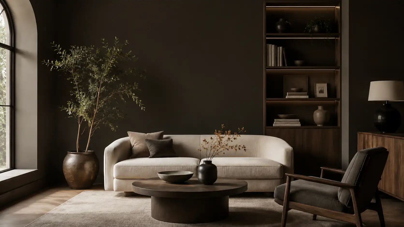
The Benjamin Moore color of the year 2026, Silhouette AF-655, is a deep espresso-brown with refined charcoal undertones that bring structure and warmth to any interior.
This rich, grounded hue sits at the center of the 2026 Color Trends palette, offering a dark neutral that works across rooms, finishes, and design styles.
From full wall coverage to bold cabinetry, Silhouette is built for homes that want depth without drama and style without effort.
What is the Benjamin Moore Color of the Year 2026?
Benjamin Moore officially announced Silhouette AF-655 as its Color of the Year 2026 in October 2025.
The announcement marked a shift away from the moody plum brown tones of 2025’s Cinnamon Slate toward something richer, darker, and more architectural
Silhouette is described by Benjamin Moore as a color “reminiscent of tailored suiting,” blending the depth of burnt umber with soft charcoal notes to create a hue that reads as both polished and livable.
With an LRV of 10.18, Silhouette absorbs light rather than reflecting it, making spaces feel intimate and considered. This is one of the more intentionally dark Color of the Year picks in recent cycles.
Within the 2026 Color Trends palette, it anchors a mix of soft pales and earthy midtones, giving the full collection both structure and balance across a range of design styles.
Silhouette AF-655: The 2026 Color Story
Silhouette AF-655 is built on a foundation of rich espresso-brown layered with subtle charcoal influence. The result is a color that sits between warm and cool: grounded, architectural, and quietly refined.
- Deep espresso base: The core of Silhouette is a burnt umber warmth that reads brown in natural light and leans cooler in shade.
- Charcoal undertones: Soft gray notes give the color structure, keeping it from reading as purely brown or muddy.
- Grounded mood: The overall effect is calm, structured, and deliberate: a color that anchors a room without overpowering it.
- Architectural quality: Silhouette works equally well on full walls, cabinetry, or trim, lending a built-in sharpness to any application.
- Fashion-forward inspiration: The color directly references classic suiting: think fine wool fabrics in dark espresso tones with a polished, restrained edge.
The 2026 design direction is defined by warmth, depth, and restraint. Silhouette captures all three while remaining versatile across a wide range of spaces and palettes.
Why Silhouette AF-655 in 2026
Andrea Magno, Benjamin Moore’s director of color marketing and design, has pointed to a renewed interest in suiting and classic tailoring as a driving force behind this year’s pick.
She has noted a growing pull toward the brown color family across both fashion and interiors, with Silhouette capturing that mood through its mix of burnt umber and soft charcoal. Color experts at Benjamin Moore study trade shows, runways, and cultural signals before choosing a color.
For 2026, one theme stood out: a desire for structure, comfort, and timeless quality. The interiors market had spent years in stark whites and cool grays.
Silhouette moves away from that toward earthy depth and material richness. The “quiet luxury” direction, which values craftsmanship and restraint, is exactly where Silhouette lands.
Benjamin Moore 2026 Color Palette
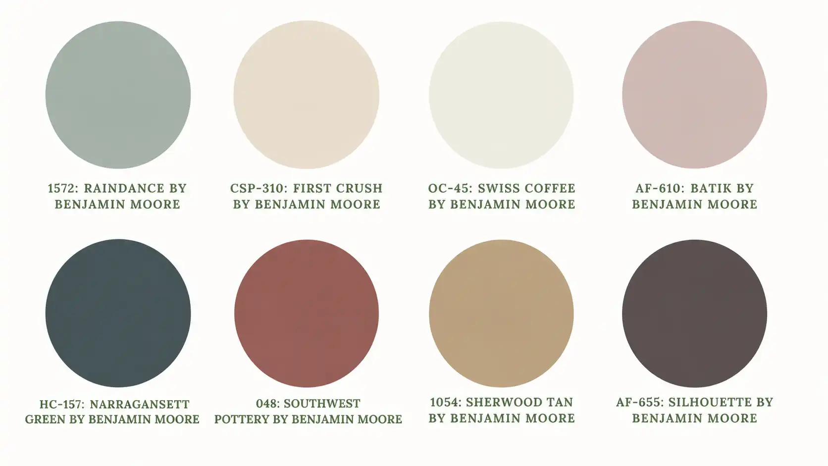
The 2026 Color Trends palette pairs Silhouette AF-655 with seven supporting shades designed to layer, contrast, and complement across a range of design styles.
The palette moves from soft, lifted pales through earthy midtones down to the deep anchor of Silhouette itself.
| Color | Code | Description |
|---|---|---|
| Silhouette | AF-655 | Rich espresso-brown with charcoal notes; the palette anchor |
| Swiss Coffee | OC-45 | Warm, creamy white that adds light and softness |
| First Crush | CSP-310 | Muted blush with a subtle warmth |
| Raindance | 1572 | Steely green with easy gray undertones |
| Narragansett Green | HC-157 | Blackened teal with a strong architectural quality |
| Southwest Pottery | 048 | Sunbaked earthy clay with brown and red tones |
| Sherwood Tan | 1054 | Grounded golden tan with earthy brown notes |
| Batik | AF-610 | Dusty violet-rose with a versatile, muted character |
The surrounding shades- muted greens, soft creams, earthy clays, and dusty blush tones- all sit comfortably against it, creating layered combinations that feel warm and deliberate.
Undertones of Silhouette AF-655Silhouette AF-655 has a deep espresso base with charcoal running through it. Warm lighting pulls the brown tones forward; cooler, north-facing light brings out the gray-brown side. It stays grounded across both conditions, shifting without losing its character. |
How to Use Silhouette in Interior Design
Silhouette AF-655 works across every room in the home, from high-traffic living areas to quiet, intimate spaces. The key is understanding how its depth interacts with light, materials, and surrounding colors.
1. Living Room
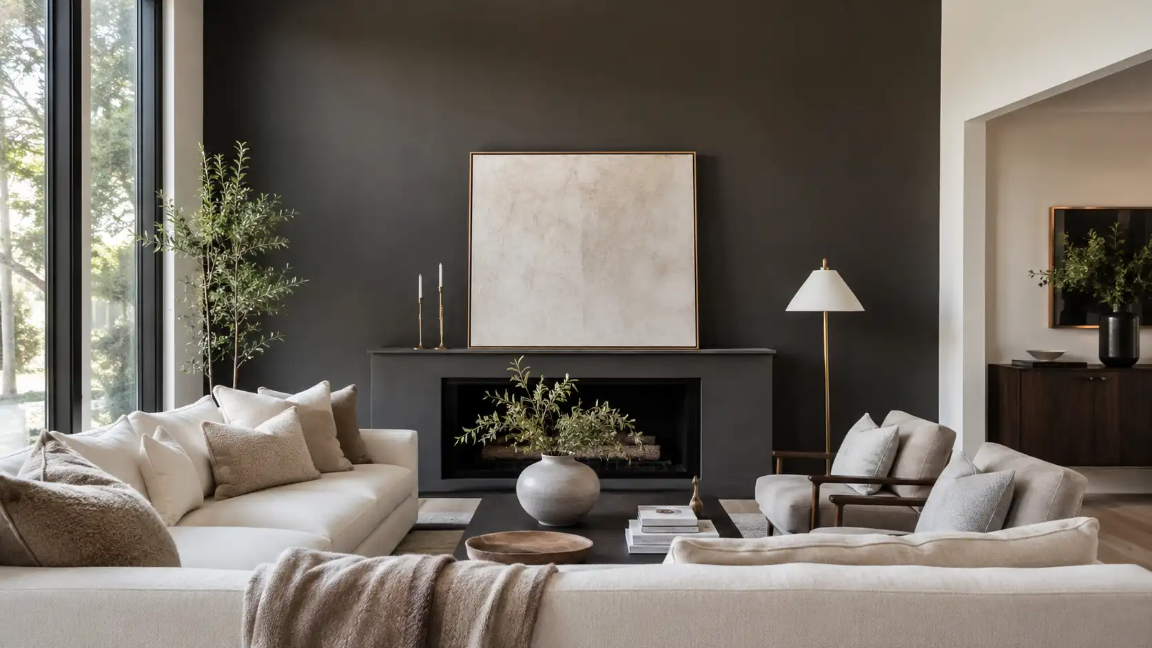
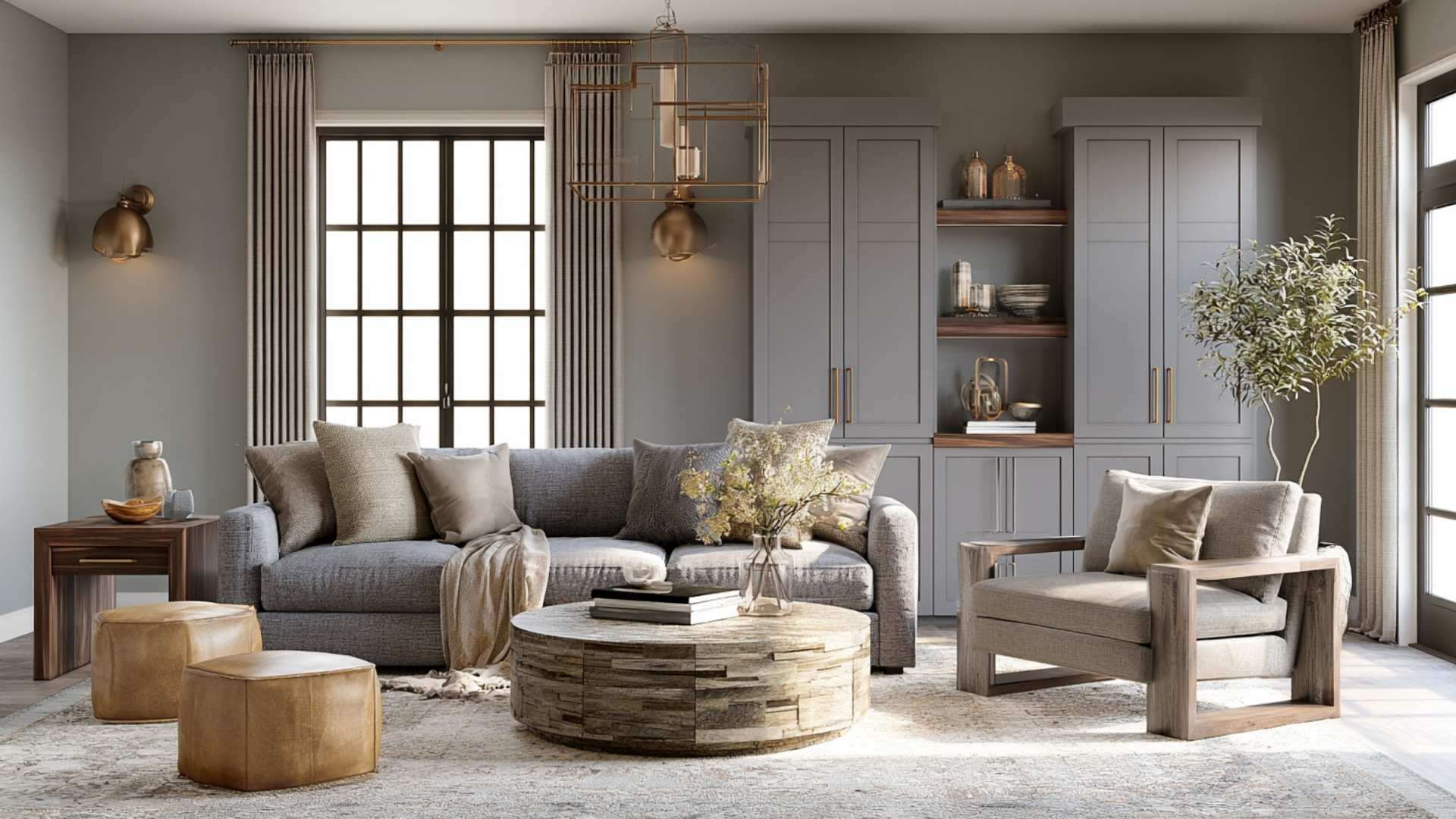
Silhouette reads best on a single accent wall in a living room, creating a defined focal point behind a sofa or fireplace. Full coverage works well in larger rooms with tall ceilings and good natural light.
Pair it with soft textiles: linen throws, wool cushions, bouclé upholstery, and layer warm neutrals in cream, greige, or sand to stop the room from feeling too heavy.
Pro tip: Use matte finish on walls and bring in brushed brass fixtures to add warmth without shine.
2. Bedroom
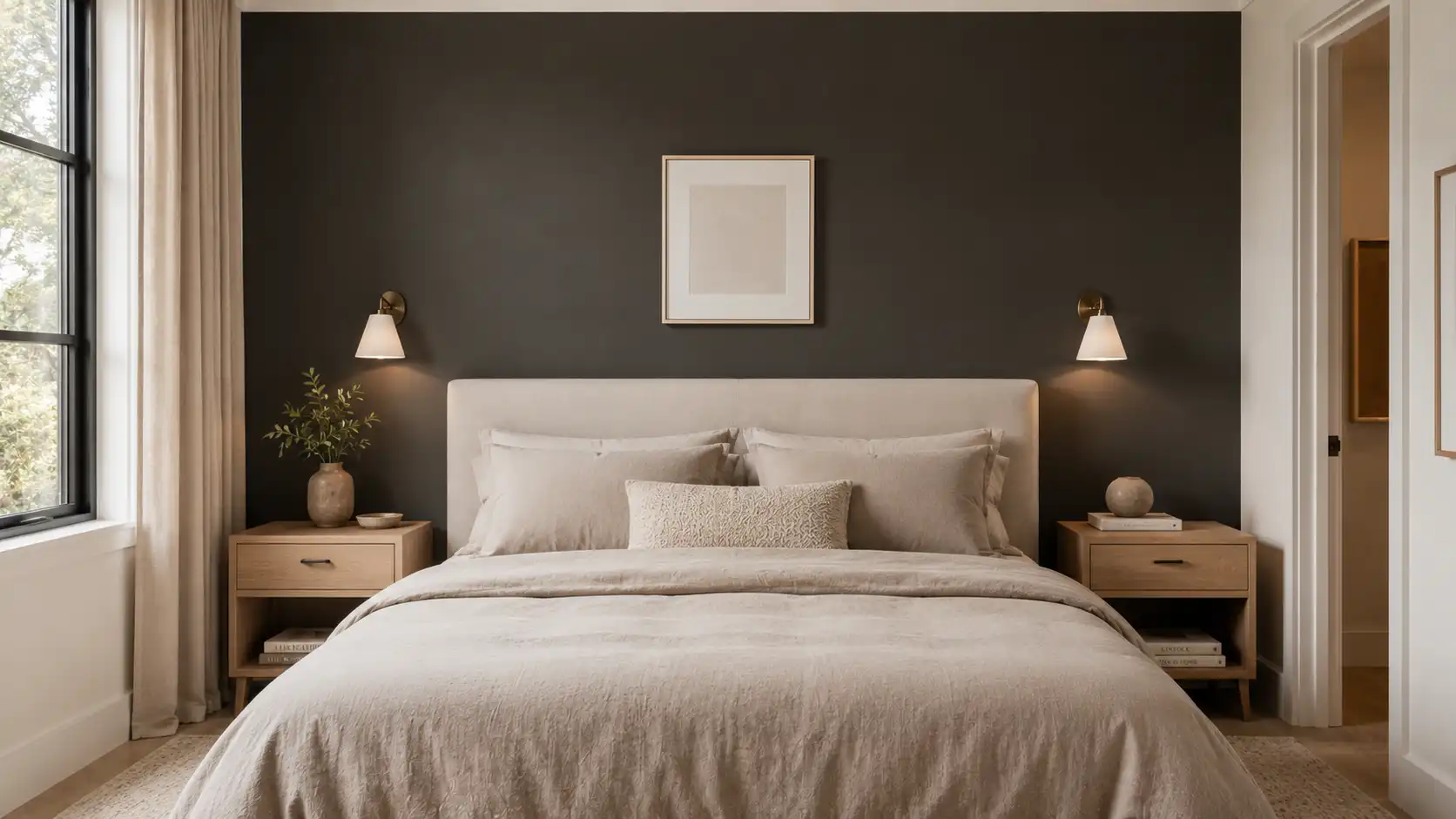
In the bedroom, Silhouette creates a cocooning, restorative atmosphere that works especially well in rooms used for rest. The depth of the color makes the space feel deliberately calm.
Pair with linen bedding in natural or taupe tones, warm white trim, and soft ambient lighting to keep the room from feeling too closed in.
Pro tip: Apply Silhouette to the wall behind the headboard only for a moody, grounded backdrop that doesn’t darken the whole room.
3. Kitchen
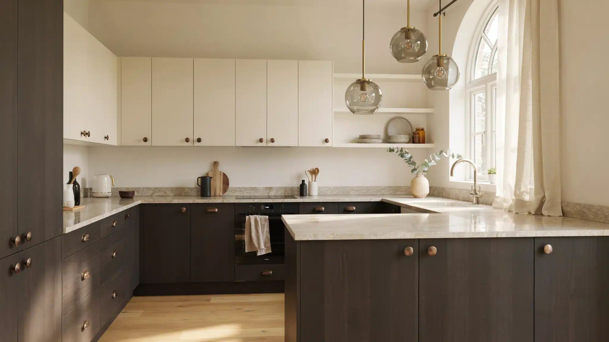
Silhouette works strongly as a cabinetry color in the kitchen, particularly for lower cabinets or a kitchen island. It pairs naturally with stone countertops: travertine, limestone, or leathered granite, and brushed brass or aged bronze hardware. Upper cabinets in Swiss Coffee or a warm cream keep the kitchen feeling open.
Pro tip: Use a satin finish on kitchen cabinetry for easy cleaning while maintaining the color’s rich depth.
4. Bathroom
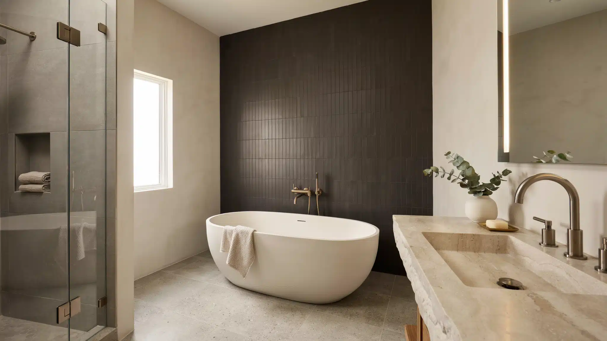
In the bathroom, Silhouette delivers a spa-like, moody atmosphere that feels both relaxing and refined. It works best with white marble, plaster walls, or light stone as a contrasting surface. Keep fixtures in brushed nickel or warm brass and use a large mirror to reflect light back into the space.
Pro tip: Limit Silhouette to a single feature wall in small bathrooms to add depth without making the space feel boxed in.
5. Entryway / Hallway
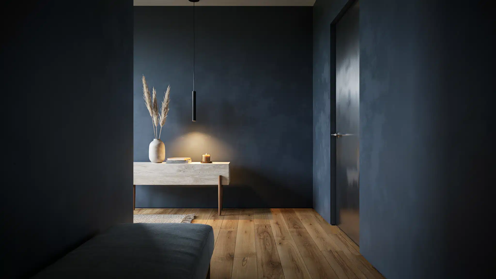
Silhouette makes a strong first impression in an entry, signaling a considered, design-forward home from the moment you walk in.
It handles low-light transitional spaces well because its warmth keeps it from reading as cold or flat. Pair with natural wood flooring and a statement light fixture to lift the space.
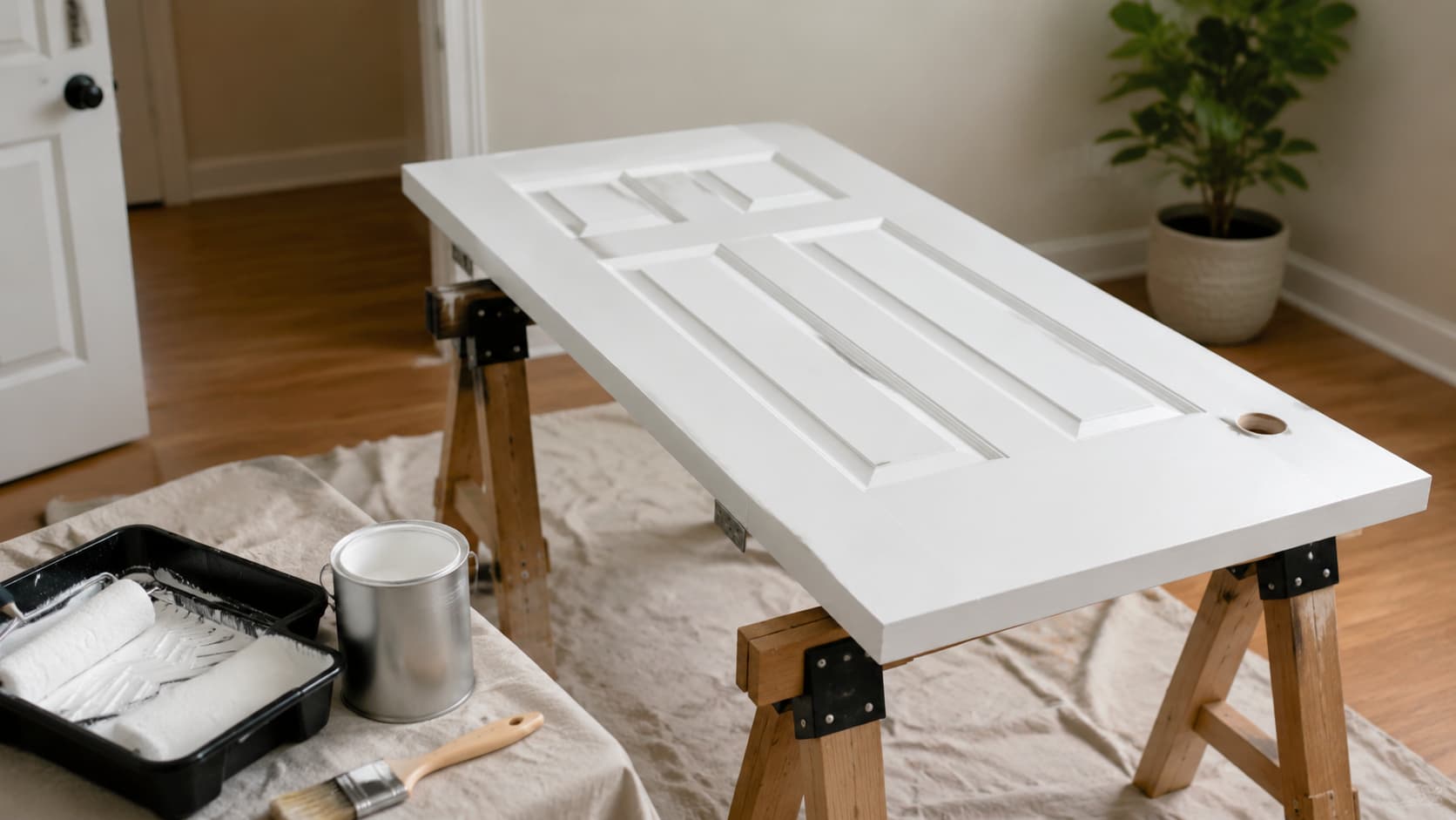
Pro tip: Use a full-gloss finish on an entryway door in Silhouette for a polished, lacquer-like effect that withstands daily use.
Each room calls for a slightly different approach, but the same principle carries through every space. Let Silhouette anchor the room, and use lighter materials around it to keep the sense of depth intentional rather than heavy.
Best Color Pairings with Silhouette AF-655
Silhouette AF-655, Benjamin Moore’s Color of the Year 2026, looks best with soft neutrals, muted greens, natural wood, and warm metals. These pairings balance the deep, espresso-toned shade for a finished, livable space.
| Category | Best Pairings |
|---|---|
| Off-white | Swiss Coffee OC-45 |
| Neutrals | Ivory, greige, sand |
| Greens | Sage, olive |
| Wood | Pale oak, walnut |
| Leather | Tan, cognac |
| Metals | Brushed brass, aged bronze |
| Textiles | Raw or bleached linen |
Pairing Silhouette AF-655 with light neutrals, soft greens, natural wood, and warm metals keeps the color grounded and balanced.
Pairing Silhouette with The Right Materials
Silhouette AF-655 rewards careful material choices. The right finishes, wood tones, stones, and fabrics add the dimension and warmth that dark neutrals need to feel complete.
- Matte wall finish: Reduces glare and adds depth to the wall surface, keeping the color rich and flat.
- Satin cabinetry finish: Durable and slightly reflective, it withstands daily use while maintaining the color’s depth.
- Oak and walnut tones: Warm wood tones balance Silhouette’s espresso base and stop the space from feeling cold.
- Travertine and limestone: Light veining in natural stone creates a clean contrast against the deep, dark wall color.
- Bouclé, wool, and velvet: Textured fabrics add softness and warmth that flat dark walls need to feel layered.
- Brushed brass and aged bronze: Warm metals pick up the brown undertones in Silhouette, adding a grounded finish.
Texture is not optional with a color this deep. The right material choices are what separate a heavy, flat space from one that feels rich and considered.
Comparison With Previous Benjamin Moore Colors of the Year
Silhouette AF-655 marks a clear break from recent years. Below is a quick look at how the last six picks compare in tone, mood, and LRV.
| Year | Color | Tone | LRV | Mood |
|---|---|---|---|---|
| 2026 | Silhouette AF-655 | Espresso brown with charcoal notes | 10.18 | Grounded, structured |
| 2025 | Cinnamon Slate | Plum brown | 19.71 | Moody, sophisticated |
| 2024 | Blue Nova | Blue violet | 16.98 | Deep, cosmic |
| 2023 | Raspberry Blush | Coral red | 21.12 | Energetic, bold |
| 2022 | October Mist | Sage green | 46.54 | Fresh, natural |
| 2021 | Aegean Teal | Blue green teal | 24.46 | Coastal, calming |
| 2020 | First Light | Pale pink | 75.86 | Airy, light |
Where past picks leaned toward soft pastels or cool blues, Silhouette returns to a darker, warmer palette, putting brown back at the center of home design for 2026.
Lighting Impact on Silhouette AF-655
Lighting is the single biggest factor in how Silhouette reads on a wall. In north-facing rooms with cool, indirect light, the charcoal undertones become more visible, and the color shifts toward a gray-brown.
In south-facing rooms with strong natural light, the espresso warmth comes forward, and the color feels richer. Warm yellow LED bulbs pull out the brown tones; daylight-spectrum bulbs make the gray side more visible.
To avoid a flat, lifeless effect, layer three types of artificial lighting:
- Ambient lighting from ceiling fixtures for overall brightness,
- accent lighting from wall sconces to create warmth across the wall
- and task lighting to keep the room functional.
This approach lets Silhouette’s depth read as intentional rather than heavy.
Design Mistakes to Avoid
Dark neutrals reward careful planning. A few common missteps can significantly reduce the impact of Silhouette.
- Over-darkening small rooms without contrast: Silhouette needs lighter trim, ceilings, or adjacent rooms to read as intentional rather than oppressive.
- Pairing with overly cool whites: Bright, icy whites clash with Silhouette’s warm base. Use Swiss Coffee or Cloud White instead.
- Skipping texture layering: Bouclé, linen, wood, and leather are essential. Dark walls without texture feel flat and empty.
- Using too many dark tones without balance: Silhouette works as an anchor. Offset it with soft pales, creams, or warm greens.
Silhouette is a color that rewards intention. Get the balance right, and the result is a space that feels grounded, warm, and complete.
Final Thoughts
The Benjamin Moore color of the year 2026, Silhouette AF-655, brings depth, detail, and deliberate style to the interiors market at the right moment.
This espresso-brown with charcoal undertones works in nearly every room, pairs well with a wide range of materials, and retains its character under different lighting conditions. It is not a trend-dependent color: it is the kind of paint that ages well and deepens in appeal over time.
Use Silhouette as an anchor rather than an all-over color. Pair it with soft creams, warm wood tones, textured fabrics, and layered lighting.
Let natural materials fill out the palette. The result is an interior that feels considered, personal, and built to stay well past a single design season.
Frequently Asked Questions
Can Benjamin Moore Silhouette AF-655 Be Used on Exterior Surfaces
Yes. Silhouette works on siding, shutters, trim, and doors. Use Benjamin Moore Aura Exterior for the best durability on dark applications.
What is the LRV of Benjamin Moore Silhouette AF-655?
Silhouette has an LRV of 10.18, placing it in the dark range. It absorbs light, creating a deep, grounded feel.
How Does Benjamin Moore Silhouette AF-655 Compare to Sherwin-Williams Urbane Bronze?
Both are deep, warm-brown neutrals. Silhouette sits closest to Urbane Bronze SW 7048 but reads slightly warmer with more espresso depth.