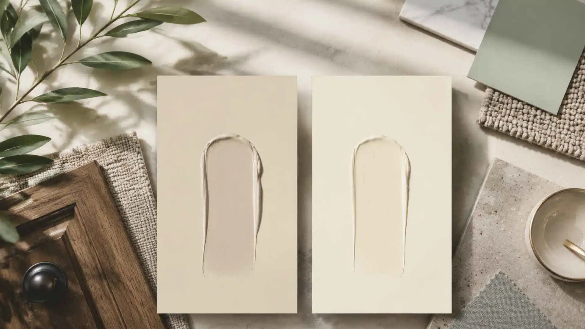
Picking the right white paint feels simple until you bring both chips home and suddenly neither looks the way you expected. The shoji white vs alabaster debate comes up constantly for a reason: these two Sherwin-Williams whites sit so close on a paint deck that most people assume the difference is barely worth worrying about.
On your walls, cabinets, or trim, that assumption gets expensive fast. The right choice depends on your room’s light, your existing finishes, and exactly what surface you are painting.
Get it wrong, and you are looking at a repaint. Every real difference between the two is laid out here so you can choose with confidence the first time.
What is Shoji White?
Shoji White sits between white and beige, with a cream base softened by a touch of gray. That gray undertone tones down the yellow and gives the color a balanced greige feel, even though it is technically an off-white.
With an LRV of 74, Shoji White reflects a good amount of light while still keeping enough depth to avoid looking stark.
In cool, indirect light, the gray undertone becomes more noticeable. In warm, sunny rooms, the creamy side comes forward, feeling soft, calm, and grounded.
Surrounding finishes can also change how it reads. Red-toned wood, terracotta tile, or pink accents may pull out subtle rosy notes.
Since Shoji White shifts throughout the day, always test it in your actual room before painting walls, cabinets, or trim.
What Is Alabaster?
Alabaster is a near-white with soft yellow-cream undertones and an LRV of 82. It reflects more light than Shoji White, so it feels brighter, cleaner, and closer to a true white without looking harsh. Sherwin-Williams named it Color of the Year in 2016, and it has stayed popular for walls, trim, and cabinets.
Its warmth is subtle in most rooms, but it becomes more noticeable beside crisp whites. In that setting, Alabaster can look slightly buttery. Cool countertops, backsplashes, or tile can also make the cream base stand out more.
In kitchens or bathrooms with bright white countertops or backsplashes, that cream base can become more visible and work against a clean look.
Overall, Alabaster is a dependable warm white for traditional, farmhouse, coastal, and transitional interiors. It works best when paired with softer finishes instead of sharp, blue-white tones.
What Do They Actually Look Like Side by Side?On a chip, both colors look almost identical, soft, warm, and barely off-white. The real difference shows on a wall. Alabaster looks like a clean, warm white. Shoji White looks like a light beige next to it. Cover the trim in a room painted Shoji White, and it reads as white. Bring Alabaster into the same frame, and Shoji White immediately reads as the creamier, deeper of the two. That contrast is the fastest way to understand what separates them. |
Shoji White vs. Alabaster at a Glance
The table below covers the key differences across the factors that matter most when choosing between these two colors for real spaces.
| Feature | Shoji White SW 7042 | Alabaster SW 7008 |
|---|---|---|
| LRV | 74 | 82 |
| Undertones | Greige, beige, faint gray, and green | Soft yellow, warm cream |
| Brightness | Deeper, more absorbed, cozy | Brighter, more reflective, airy |
| True white or off-white | Off-white | Near-white (technically white at LRV 82) |
| Best use: walls | Yes, whole-house palettes | Yes, especially smaller or darker rooms |
| Best use: cabinets | Can work in warm, well-lit kitchens but requires good natural light to avoid reading gray. Alabaster is the safer cabinet choice overall. | Top choice, reads clean and timeless |
| Best use: trim and millwork | Not recommended | Yes, a widely used trim white |
| Best use: exteriors | Brick and stucco | Siding, classic curb appeal |
| North-facing rooms | Can read cool or greige | Better choice, holds warmth |
| South/west-facing rooms | Stays warm and creamy | May show more yellow in strong sun |
| Whole-house palette use | Flexible, recommended | Possible, but the yellow undertone limits pairings |
| Trim pairing (if used on walls) | Use Pure White SW 7005 for trim | Can serve as its own trim color |
LRV and undertones are the two numbers that drive most of this decision. Everything else in the table follows from those two factors.
How Undertones Make These Two Colors Look Different
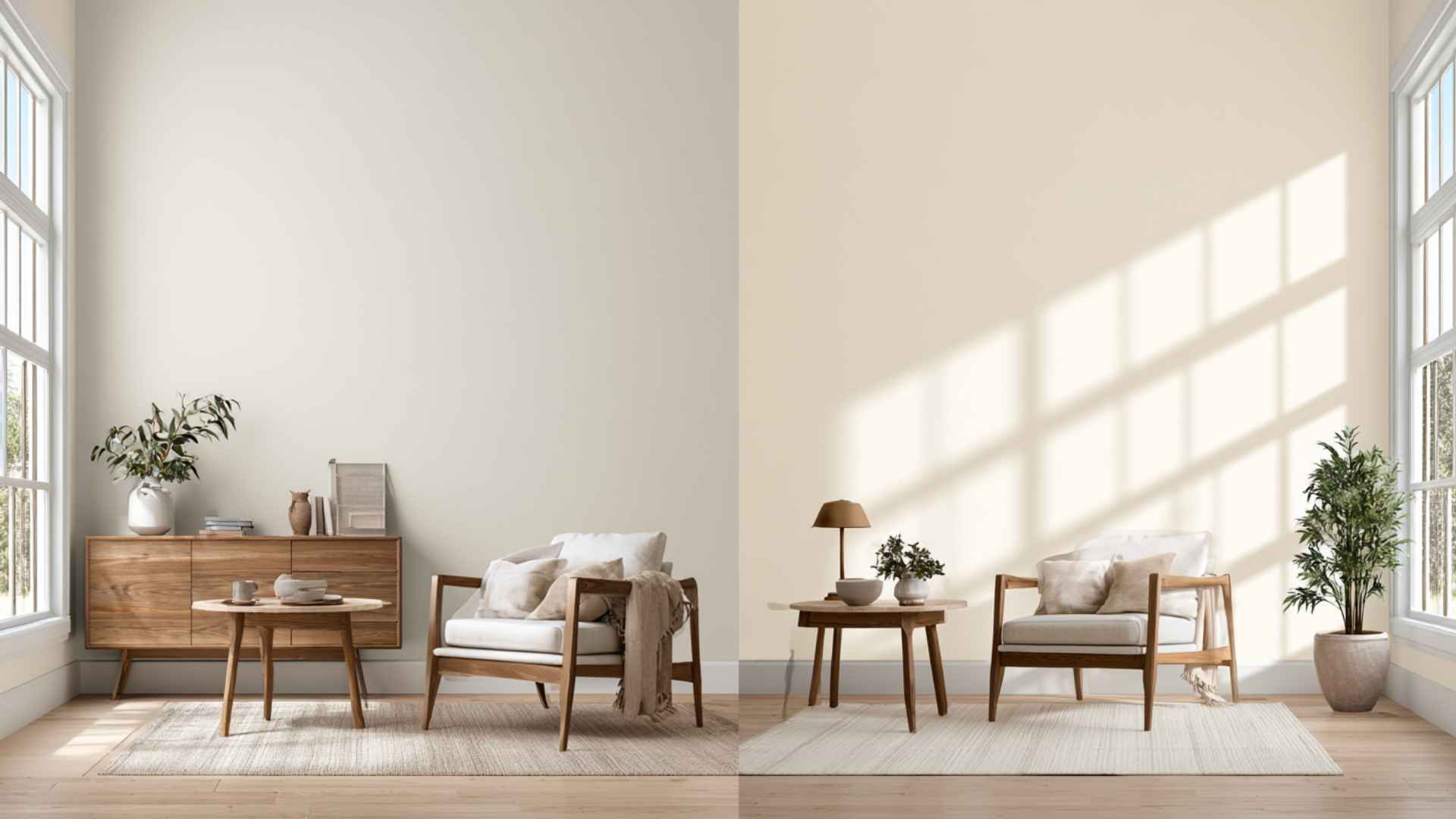
Shoji White and Alabaster look similar on a paint chip, but their undertones change on real walls. Shoji White has a cream base softened by gray, so it can read warm greige in cooler light.
Alabaster is warmer, with soft yellow and cream undertones, making it feel brighter but more likely to look creamy beside cool whites.
In rooms with warm wood floors or earthy furniture, Shoji White blends in naturally, while Alabaster can start to show more of its yellow side. That is why the finishes already in your room matter just as much as the paint color itself.
Coordinating Colors for Shoji White and Alabaster
Knowing what pairs well with each color saves you from a costly mismatch. Here is what works alongside Shoji White and Alabaster in real rooms.
Colors That Work with Shoji White:
Shoji White’s greige base pairs best with warm, earthy, and muted tones. Cooler, brighter colors can push the gray undertone forward and make the walls feel flat, so the best pairings tend to stay in the warm-neutral range.
- Warm Taupes and Greiges: Accessible Beige and Mindful Gray share similar undertones, creating a calm, layered, and cohesive look.
- Dusty Greens: Clary Sage and Retreat bring out Shoji White’s subtle green-gray undertones in an earthy, natural way.
- Gray-Blues: Uncertain Gray and Misty add cool contrast while balancing Shoji White’s creamy base without clashing.
- Dark Neutrals: Urbane Bronze and Peppercorn create bold contrast, ideal for accent walls, cabinetry, and grounded interiors.
- Trim: Pure White gives crisp trim contrast without the yellow conflict that warmer whites can create.
Colors That Work with Alabaster:
Alabaster’s yellow-cream base pairs well with a wide range of colors because its warmth is restrained enough to stay neutral in most combinations. It holds its own even next to bolder accents.
- Warm Greiges: Accessible Beige and Agreeable Gray create a cohesive look with similar warm undertones.
- Soft Sage Greens: Clary Sage and Liveable Green complement Alabaster without making it look too yellow.
- Stone Blues: Sea Salt and Comfort Gray balance Alabaster’s warmth with soft, cool contrast.
- Muted Browns and Mushroom Tones: Antique White and Townhall Tan create a grounded farmhouse or traditional palette.
- Trim and Ceiling: Pure White adds contrast, while Alabaster creates a seamless monochromatic finish.
Colors to avoid alongside Alabaster: bright cool whites, such as Chantilly Lace or Extra White, used as adjacent trim. The contrast brings out Alabaster’s yellow undertone, making it look cream-colored rather than white.
Pro Tip: When building a whole-house palette around either color, choose your accent and furniture tones first, then confirm the white reads neutrally against all of them.
Can You Use Shoji White and Alabaster Together?Shoji White and Alabaster can work together when separated by a surface, such as Shoji White walls with Alabaster cabinetry or built-ins. The pairing feels warm, layered, and cohesive. Some designers use Alabaster as trim against Shoji White walls for a soft, tone-on-tone look, since the two share a similar warmth and the contrast stays gentle. Others prefer to skip this pairing, since Alabaster’s yellow undertone can show up more next to Shoji White’s greige base in certain light. If a cleaner, more defined contrast is the goal, Pure White remains the safer trim choice. |
How Lighting Changes Shoji White and Alabaster
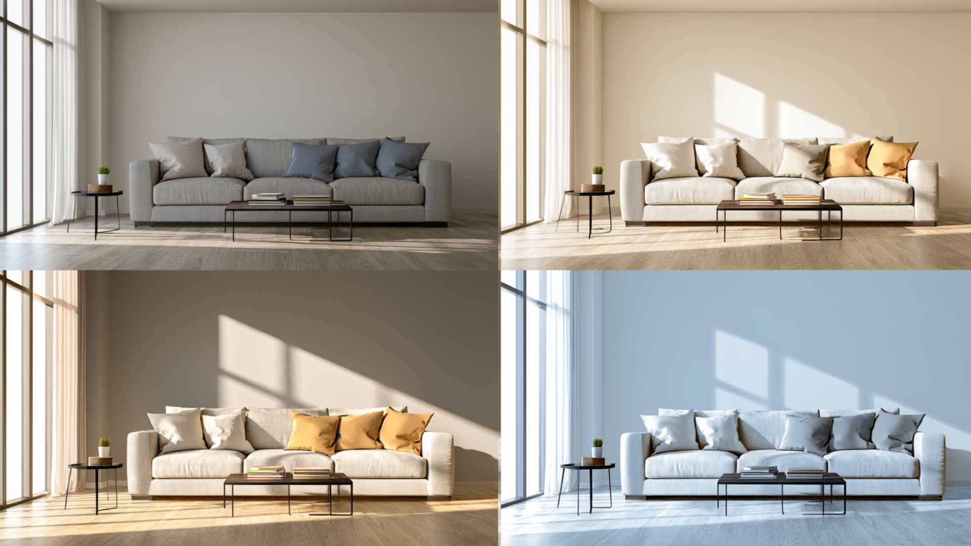
Paint colors do not exist in isolation. The same color can look warm and inviting in one room and flat or gray in another, depending entirely on how light moves through the space.
Shoji White shifts more with light than Alabaster does. Alabaster is the more predictable of the two.
- North-facing rooms: Cool northern light makes Shoji White look grayer and slightly greige. Alabaster retains more warmth because its yellow-cream base better balances the cooler light.
- South-and west-facing rooms: Warm sunlight helps Shoji White stay creamy and grounded. Alabaster also works, but strong sun can make its yellow undertone more noticeable.
- Artificial lighting: Warm bulbs make both colors creamier, while cool LEDs can make Shoji White look gray. Alabaster stays steadier, especially under cooler overhead lighting.
Check your paint sample during the time of day you spend the most time in that room. A bedroom checked only in morning light can look very different by 9 PM under lamps.
Lighting direction and bulb temperature are not afterthoughts. They determine which color actually works in your room.
Exterior Use: Which Color Works Better Outside?
Both colors hold up on exteriors, but they suit different surfaces and architectural styles.
| Exterior Surface | Recommended Color | Notes |
|---|---|---|
| Brick | Shoji White | Warm depth reads well against red or brown brick tones |
| Stucco | Shoji White | Greige base suits warm stucco textures without looking yellow |
| Siding (modern homes) | Alabaster | Brighter and cleaner on smooth surfaces; classic curb appeal |
| Trim and shutters | Alabaster | Warm white that pairs with a wide range of siding and accent colors |
| Front door surround | Either | Depends on the door color; test against fixed stone or brick first |
Shoji White on an exterior reads as a soft, warm white that works especially well with charcoal or bronze trim and with homes that have natural wood or brick elements.
Alabaster on siding delivers a classic, inviting look and pairs naturally with dark shutters, black trim, or wood accents.
Room-by-Room: Where Each Color Performs Best
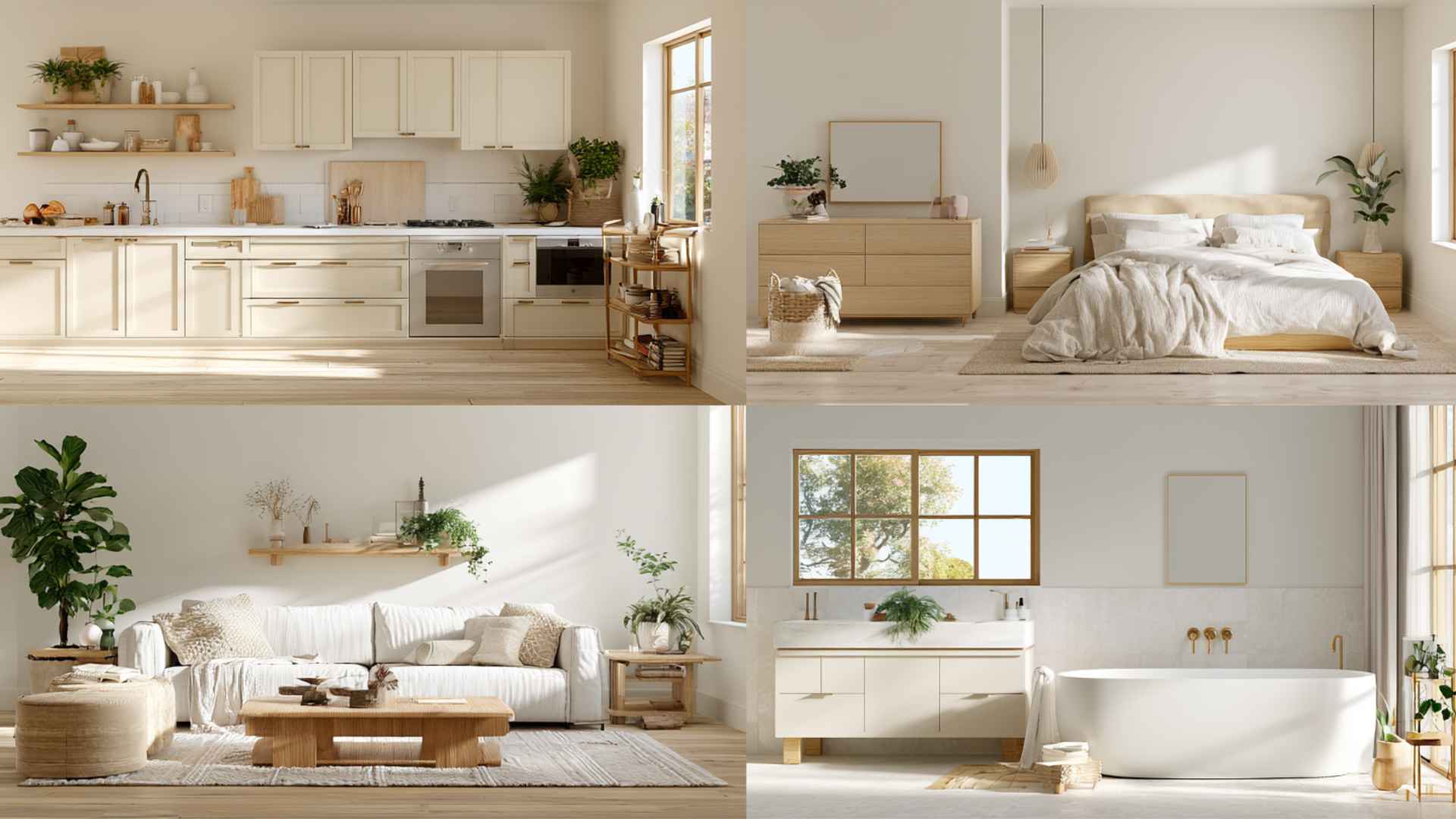
Color preference aside, these two whites have genuinely different strengths across different rooms and surfaces. The guidance below comes from real-world application patterns, not just the chip.
- Kitchen Walls and Cabinets: Shoji White suits warm kitchen walls, while Alabaster works better on cabinets because it reads cleaner against counters, stone, and stainless steel.
Bedroom: Alabaster keeps bedrooms soft and open, while Shoji White creates a moodier, grounded look that suits warm woods and earthy decor.
Living Rooms: Alabaster handles changes in living room lighting more reliably, while Shoji White adds depth in bright rooms with wood, stone, or earthy furniture.
Bathrooms: Alabaster brightens bathrooms and suits light tile, while Shoji White works better in spa-style spaces with wood, brass, and matte finishes.
Trim, Ceilings, and Millwork: Alabaster works well for trim and millwork, while Shoji White needs a brighter trim, such as Pure White, to create visible contrast.
Beyond the practical applications, the two colors create noticeably different feelings in a room. Shoji White feels grounded, calm, and cozy. It suits spaces where warmth and softness matter more than brightness.
Alabaster feels cleaner, airier, and more open. It suits spaces where you want the room to feel fresh without going cold. That emotional difference is worth factoring in alongside lighting and surface type.
Which One Should You Choose?
The decision comes down to two things: what surface you are painting and what direction the light comes from.
| Choose Shoji White if you… | Choose Alabaster if you… |
|---|---|
| Want a warm, grounded, whole-house neutral | Are you painting kitchen cabinets, trim, or millwork |
| Have south- or west-facing rooms with good light | Have a north- or east-facing room that needs brightness |
| Are you painting exterior brick or stucco | Are you painting exterior siding |
| Want warmth with wood, leather, or earthy tones | Want a classic farmhouse, coastal, or traditional look |
| Prefer depth and cozy character in a living room or bedroom | Want a bedroom or small room to feel open and airy |
| Are you using modern minimal style or Scandinavian-influenced decor | Need a trim color that works with many wall colors |
What to Avoid with Shoji White and Alabaster
Both colors are forgiving in the right setting. In the wrong one, small mistakes become very visible. Here is what to watch out for with each.
Shoji White:
- Avoid rooms without natural light: Shoji White needs light to stay soft. In dark rooms, its gray undertone can take over, making it look muddy or dingy.
- Avoid cool white trim: Bright cool whites can make Shoji White look beige or tan. Use Pure White instead for softer, cleaner trim contrast.
- Avoid warm creams and tans: Too many warm off-whites can create undertone conflict. Shoji White may look yellow or dirty beside cream tile, beige counters, or tan cabinetry.
Alabaster:
- Avoid bright, cool whites: Crisp whites like Chantilly Lace, Extra White, or glossy appliances can make Alabaster look more yellow by exposing its warm cream undertone.
- Avoid cool-toned tile: Cool marble, subway tile, and gray grout can make Alabaster’s yellow undertone stand out, so it stops reading as a clean white.
Most paint regrets come from one of these situations. Catching the conflict before painting is faster and cheaper than repainting after.
How to Sample Shoji White and Alabaster Before You Commit
Paint chips and screen previews will not tell you how either color behaves in your specific room. The only reliable method is a large sample on your actual wall.
Get a peel-and-stick sample of each color in at least a 12×12 size. Stick both on the wall you plan to paint, side by side if possible, and leave them up for a full day.
Check them in the morning light, in the afternoon sun, and in the evening under your lamps. If you have overhead lighting and lamps, check under both separately.
Pay attention to whether Shoji White pulls gray or green in your specific light, and whether Alabaster starts to look more cream than white against your counters, tile, or trim. What you see in those conditions is what you will live with. No chip, photo, or description replaces that test.
Bottom Line
The shoji white vs. alabaster debate does not have a universal winner because they serve genuinely different purposes.
Shoji White is the better wall and whole-house color: warmer, deeper, and more flexible across different furniture styles and lighting conditions.
Alabaster is the better cabinet, trim, and exterior color: brighter, cleaner, and more timeless in those specific applications. Many well-designed homes use both, with Shoji White on walls and Alabaster on millwork or cabinetry.
Both colors are standard Sherwin-Williams stock at the same price point and available in all sheens from flat to high-gloss. Neither is harder to find nor more expensive than the other. The decision comes down entirely to your room, not your budget.
Frequently Asked Questions
Is Shoji warmer than Alabaster?
Alabaster reads as warmer visually because its yellow-cream undertone is more prominent, even though its higher LRV makes it feel brighter overall. So Shoji White has more depth, while Alabaster has more visible warmth.
Does Shoji White Look Gray on Walls?
Yes, it can. In north-facing rooms or under cool LED lighting, the gray undertone comes forward and the color shifts from soft cream to a noticeable greige. Warm bulbs (2700K to 3000K) bring the cream side back.
Which Is Better for Kitchen Cabinets?
Alabaster is the more popular choice for painted cabinets. Its cream base reads as clean, warm white against most countertops and does not lean yellow unless placed next to crisp, bright whites.
Can You Use Shoji White and Alabaster in The Same Room?
Yes, if they are on separate planes. Shoji White walls with Alabaster cabinets work well. Using both on adjacent surfaces, like walls and trim, creates an undertone conflict.
Which One Is More Popular, Shoji White or Alabaster?
Alabaster is more widely used overall, especially for cabinets, trim, and traditional interiors. Shoji White has been growing quickly in modern, whole-house neutral projects.