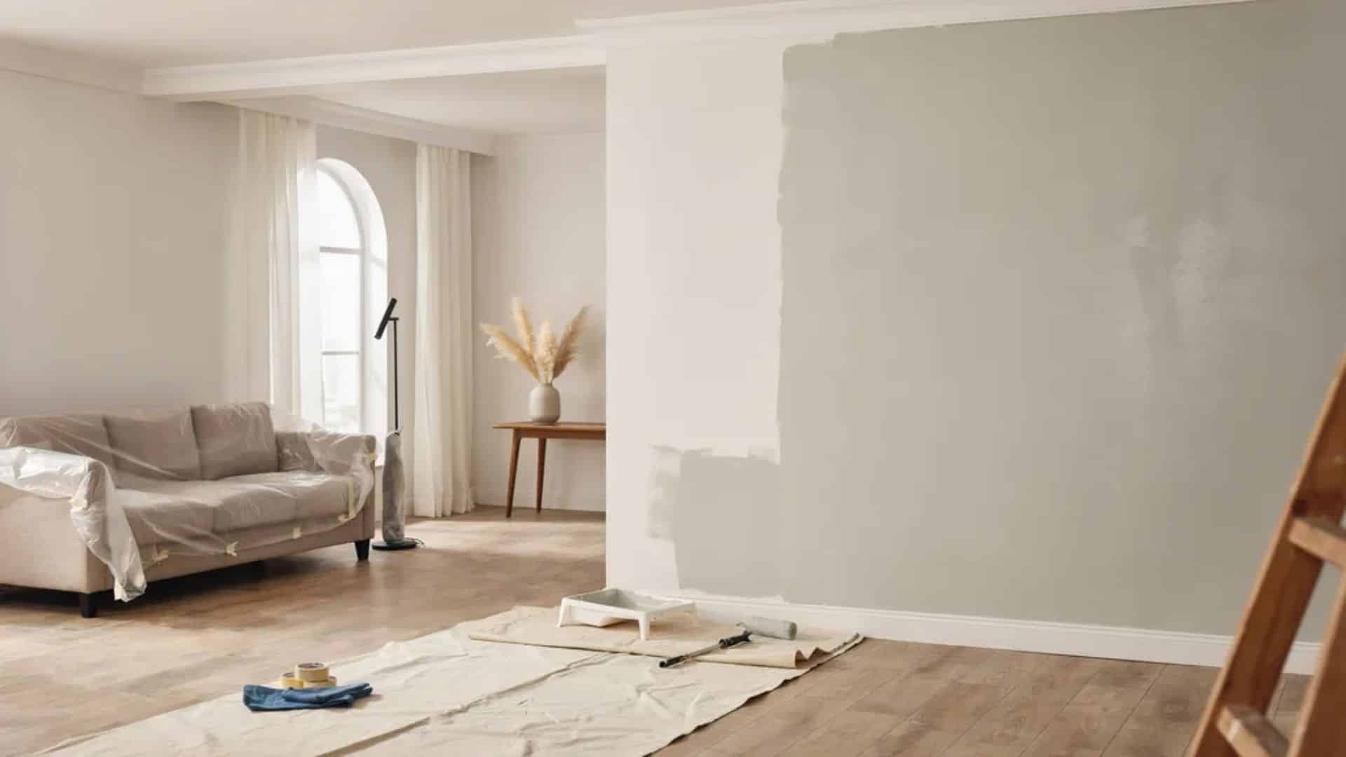
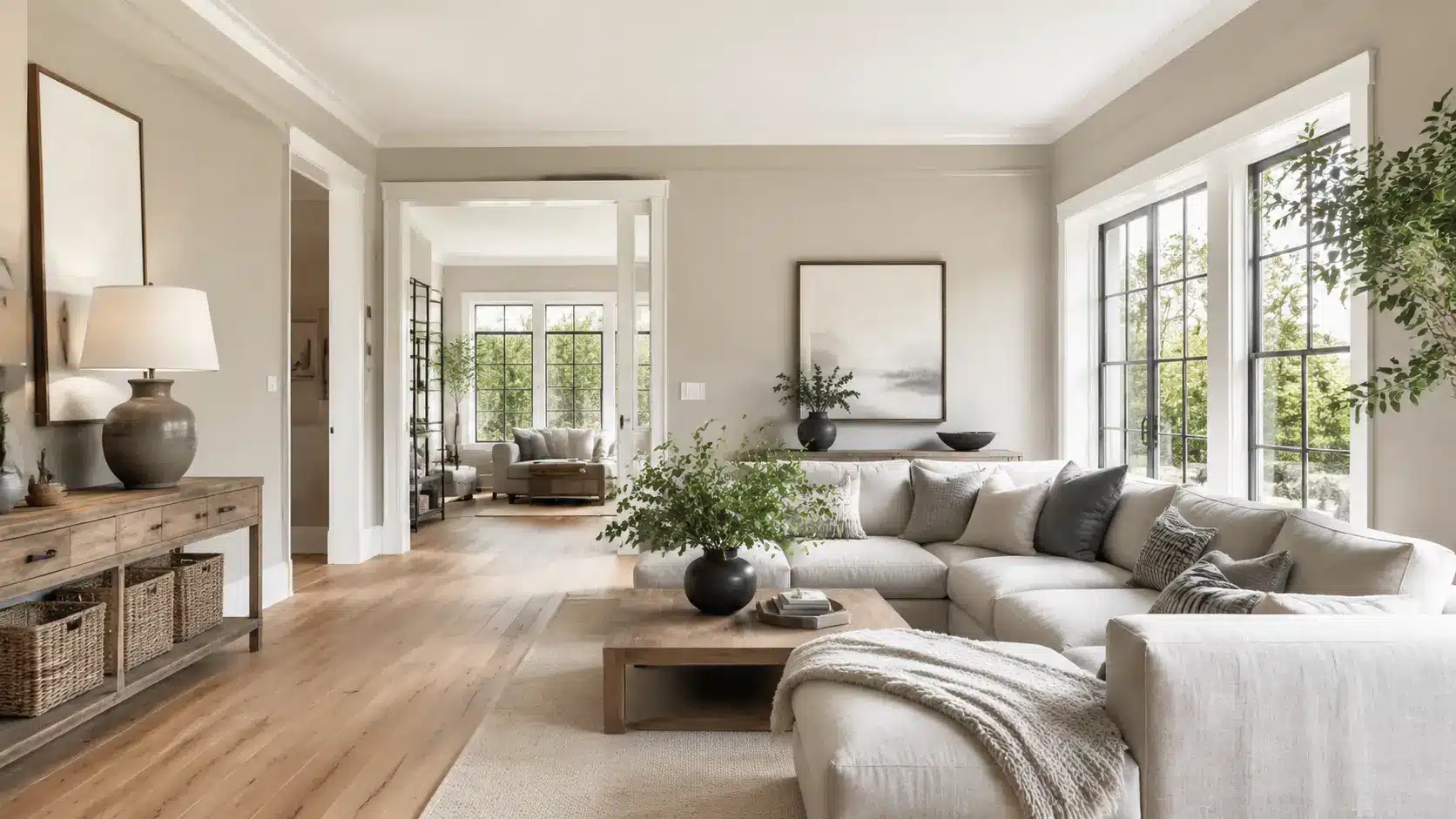
Two of Sherwin-Williams’ most popular gray paints, and somehow they look almost identical on the chip.
Agreeable Gray and Repose Gray fool a lot of homeowners at first glance. But put them on your walls, and the difference becomes very real, very fast.
One runs warm and cozy. The other goes cooler and cleaner. Picking the wrong one means repainting in six months.
This breakdown covers undertones, lighting behavior, best rooms, and a clear final call so you can buy the right can the first time.
Agreeable Gray vs Repose Gray at a Glance
Before diving into the details, here’s a quick side-by-side comparison of Agreeable Gray and Repose Gray. This overview highlights their key differences to help you narrow down your choice.
| Feature | Agreeable Gray | Repose Gray |
|---|---|---|
| Color Code | SW 7029 | SW 7015 |
| HEX | #D1CBC1 | #CCC9C0 |
| LRV | 60 | 58 |
| Undertones | Warm beige, soft greige | Taupe with a hint of violet |
| Warm or Cool | Warm | Slightly cooler |
| Best Rooms | Living rooms, kitchens, open plans | Bedrooms, bathrooms, modern spaces |
| Best Lighting | Works in most light; shines in south-facing | Works in bright rooms; struggles in north-facing |
| Best Trim Colors | Extra White SW 7006, Pure White SW 7005 | Pure White SW 7005, Alabaster SW 7008 |
| Best Cabinet Colors | White or cream | White or charcoal |
While both are versatile neutrals, their undertones and lighting response set them apart. Let’s take a closer look at each color to see which one is the better fit for your home.
Agreeable Gray SW 7029 Overview
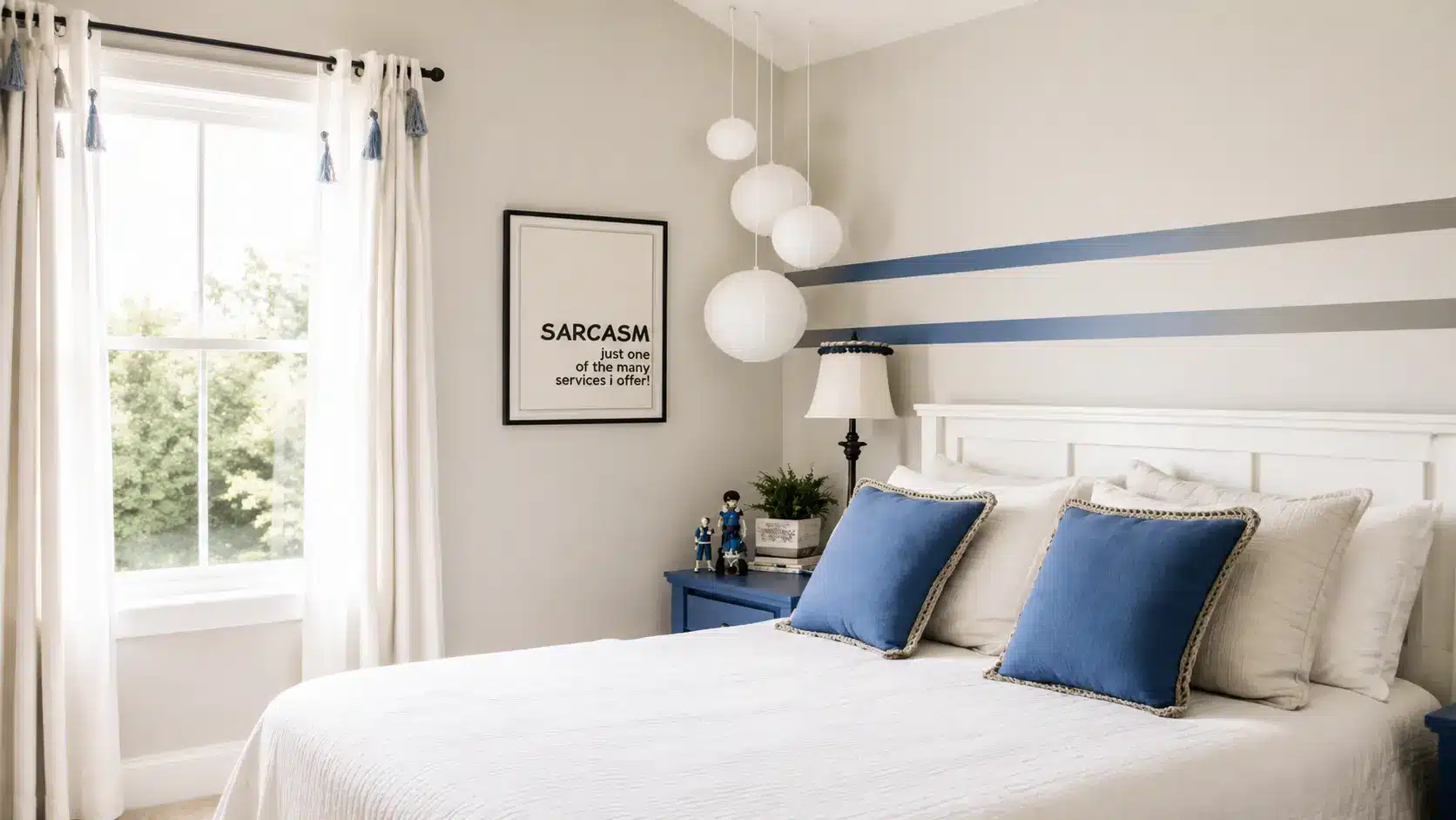
Credit: Sherwin-Williams
Agreeable Gray has earned its reputation as one of Sherwin-Williams’ best-selling paint colors. Here’s what makes this warm greige such a popular choice for homes.
Color Codes and Technical Details
Agreeable Gray carries a HEX code of #D1CBC1 and RGB values of 209, 203, 193. Its light reflectance value is 60.
This sits in a sweet spot where it reflects enough light to keep a room from feeling dark, yet still shows up as a real color on the wall rather than washing out to near-white.
Undertones
Agreeable Gray is a warm greige, meaning it lands between gray and beige without fully committing to either.
Its undertones are soft beige with a tiny hint of taupe. In warm light, it can read slightly creamy. In cooler rooms, it pulls more neutral gray.
Most of the time, it stays predictable, which is one of the main reasons homeowners love it.
Where it Works Best
Agreeable Gray works well in living rooms, open floor plans, kitchens, and anywhere you want warmth without going full beige. It also holds up well on exteriors. It suits transitional, farmhouse, traditional, and coastal styles.
Repose Gray SW 7015 Overview
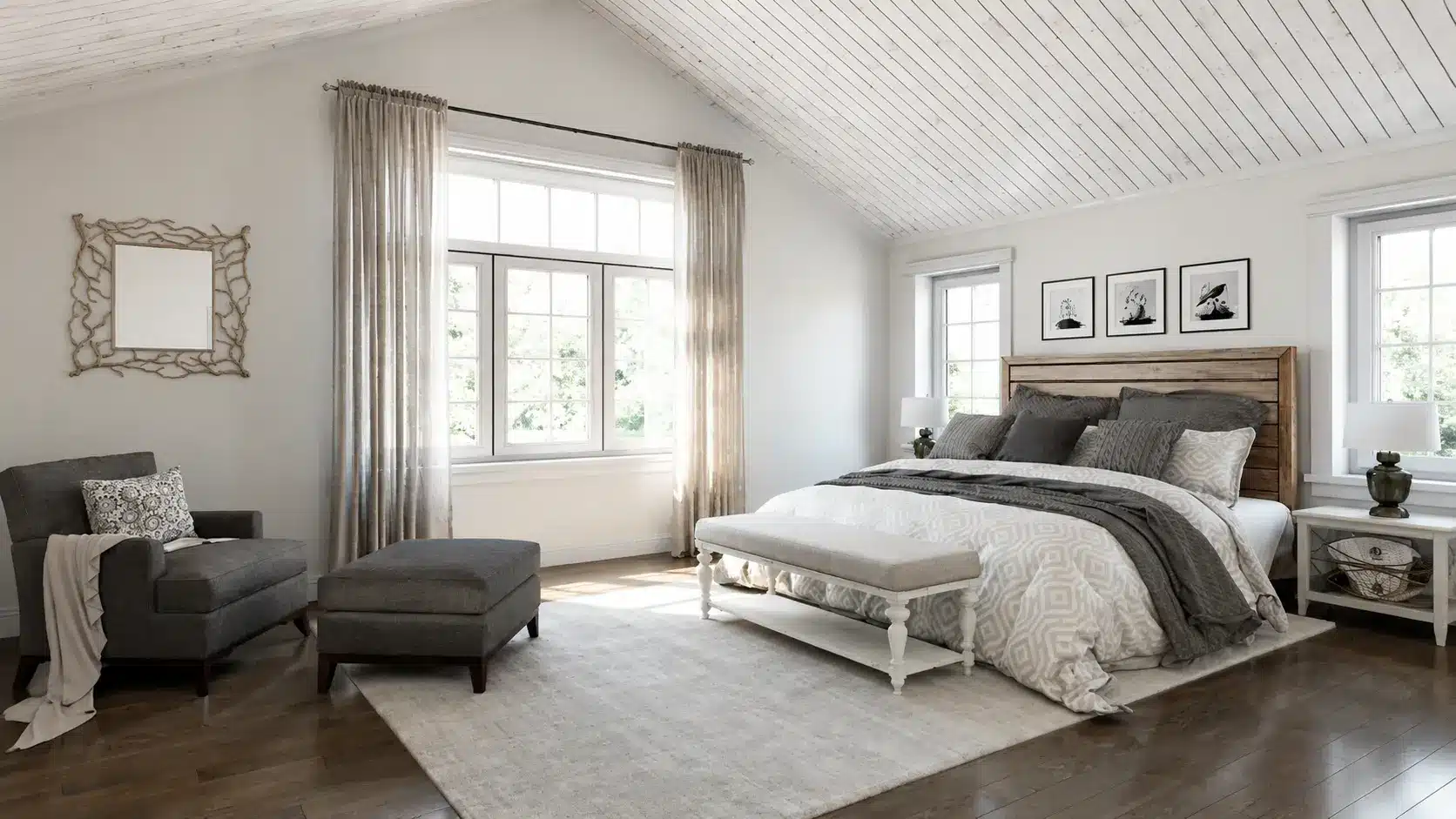
Credit: Sherwin-Williams
While Repose Gray belongs to the same greige family, it creates a noticeably different look. Here’s a closer look at its color profile and where it performs best.
Color Codes and Technical Details
Repose Gray has a HEX code of #CCC9C0 and RGB values of 204, 201, 192. Its LRV is 58, which makes it just a touch darker than Agreeable Gray.
It is still a light color, but the slightly lower LRV means it reads with a bit more depth.
Undertones
Repose Gray sits in the greige family too, but its undertones are trickier. There is a brown base that keeps it warm, but it also carries a quiet violet note and sometimes a faint green cast, both of which can surface in cool light or rooms that face north.
This is where most people get tripped up. In the right space, the violet is barely noticeable. In a dark or north-facing room, it can look faintly lavender.
Where It Works Best
Repose Gray shines in bedrooms, bathrooms, and contemporary spaces where you want a cleaner, slightly sharper gray. It works beautifully in rooms with solid natural light where the warm base keeps the violet in check.
Agreeable Gray vs Repose Gray: Key Differences
Although these paint colors look similar at first glance, a few key differences can completely change how they look in your home. Here’s how they compare side by side.
- Undertones Compared: Agreeable Gray has stable warm beige and soft taupe undertones that stay consistent across most rooms. Repose Gray has a warm brown base with a subtle violet undertone thatbecomes more noticeable in cool or north-facing light, so it’s worth sampling first.
- LRV and Brightness: Agreeable Gray at LRV 60 reflects slightly more light than Repose Gray at LRV 58. The difference is subtle but real. In darker rooms, Agreeable Gray holds its warmth a little better.
- Warm vs Cool Appearance: Agreeable Gray is the warmer of the two. It leans toward beige and greige. Repose Gray is cooler and reads more like a true gray, which makes it feel cleaner and more modern but also less cozy.
- Overall Feel and Style: Agreeable Gray feels relaxed, friendly, and inviting. Repose Gray feels polished and contemporary. Neither is better overall. It depends entirely on what you want the space to feel like.
The differences may seem minor on paper, but they become much more noticeable once lighting comes into play.
How Agreeable Gray Looks in Different Lighting
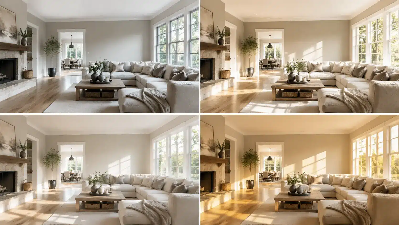
Lighting can noticeably change how Agreeable Gray appears throughout the day. Here’s what you can expect in different lighting conditions.
- North-Facing Rooms: Room light direction plays a big role in how paint colors read, and north-facing rooms get indirect, cool light all day.
- South-Facing Rooms: Warm sunlight brings out its rich greige warmth, making the color feel soft and inviting.
- East-Facing Rooms: It looks warm in the morning and becomes more neutral later in the day while keeping its cozy feel.
- West-Facing Rooms: Afternoon and evening light brings out warmth, giving it a golden cast similar to that in east-facing rooms in the morning, while mornings here tend to look flatter and cooler.
- Artificial Lighting: Warm white bulbs enhance its warmth, while cool bulbs can make it appear flatter and grayer.
How Repose Gray Looks in Different Lighting
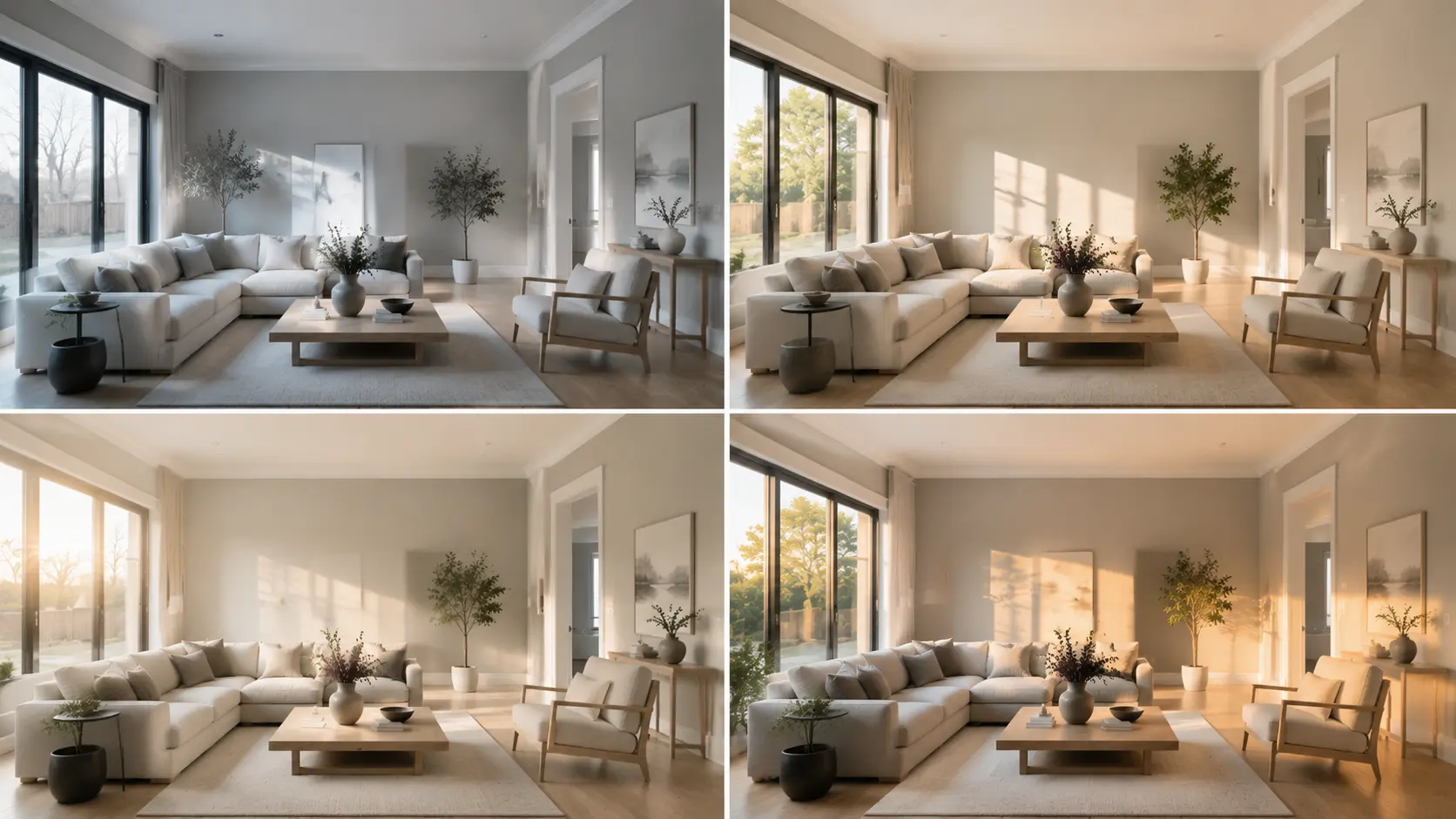
Repose Gray changes more noticeably with different lighting than Agreeable Gray. Its subtle undertones become more or less visible depending on the room and light source.
- North-Facing Rooms: Its subtle violet undertone becomes more noticeable, sometimes reading slightly lavender.
- South-Facing Rooms: Bright natural light balances the undertones, creating a clean, soft gray.
- East-Facing Rooms: Morning light keeps it warm and balanced before it shifts slightly cooler later in the day.
- West-Facing Rooms: Afternoon sun helps maintain a truer gray appearance without becoming overly beige.
- Artificial Lighting: Warm bulbs soften the color, while cool bulbs can emphasize the violet undertone.
Agreeable Gray vs Repose Gray: Room-by-Room Comparison
Some rooms naturally suit one color better than the other. Here’s where Agreeable Gray and Repose Gray perform best throughout the home.
Living Room
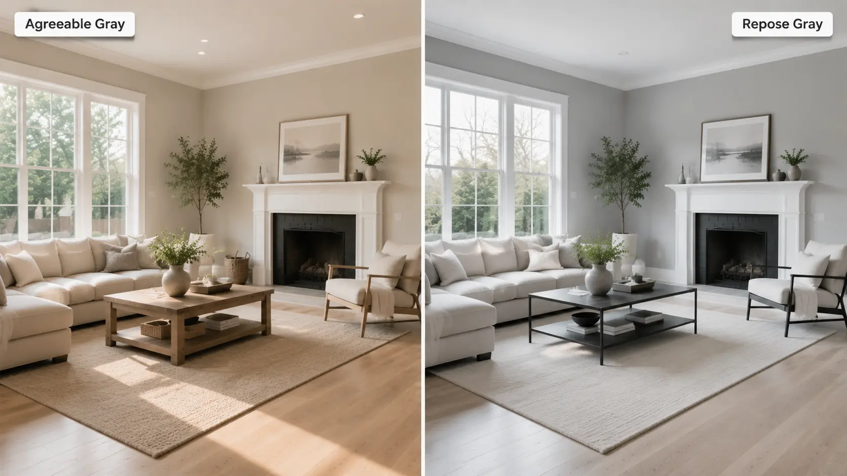
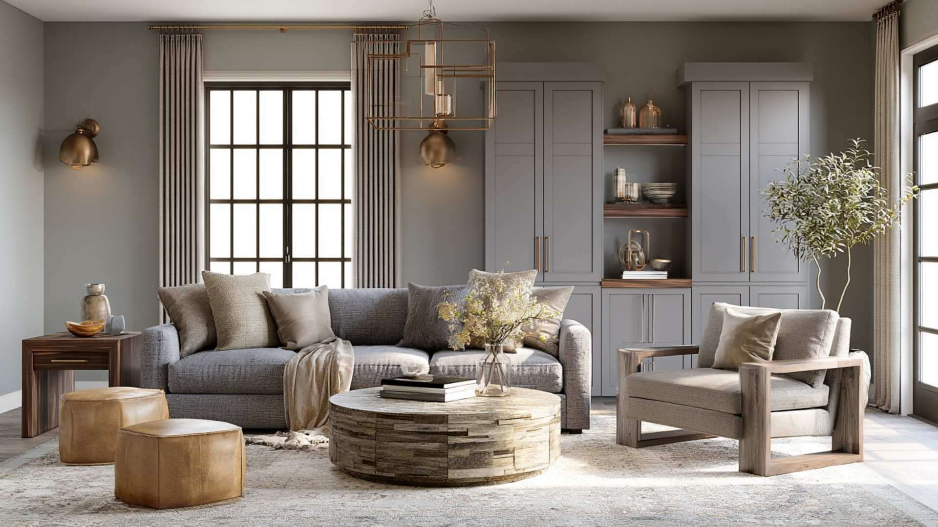
Agreeable Gray wins for most living rooms. It creates a welcoming, warm atmosphere and works with wood floors, mixed furniture tones, and warm or neutral fabrics.
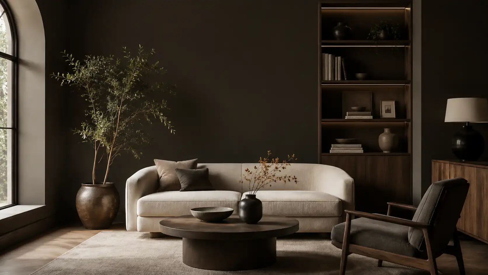
Repose Gray can work in a living room too, especially if you want a more modern or minimal look, but test it carefully if your room has cool light.
Kitchen
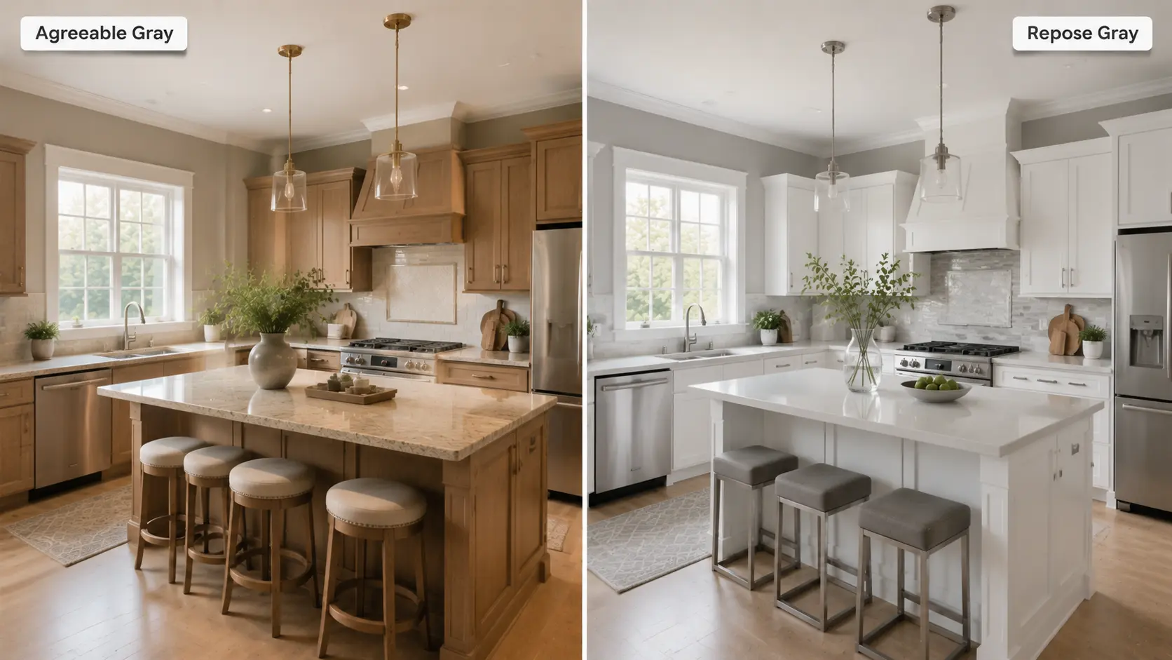
Agreeable Gray works well on kitchen walls and gives the space a cozy, livable feel. It pairs nicely with warm-toned wood cabinets and natural stone counters.
Repose Gray looks sharp with white cabinets and cool hardware. Both are solid choices. Your cabinet and countertop color should guide the decision.
Bedroom
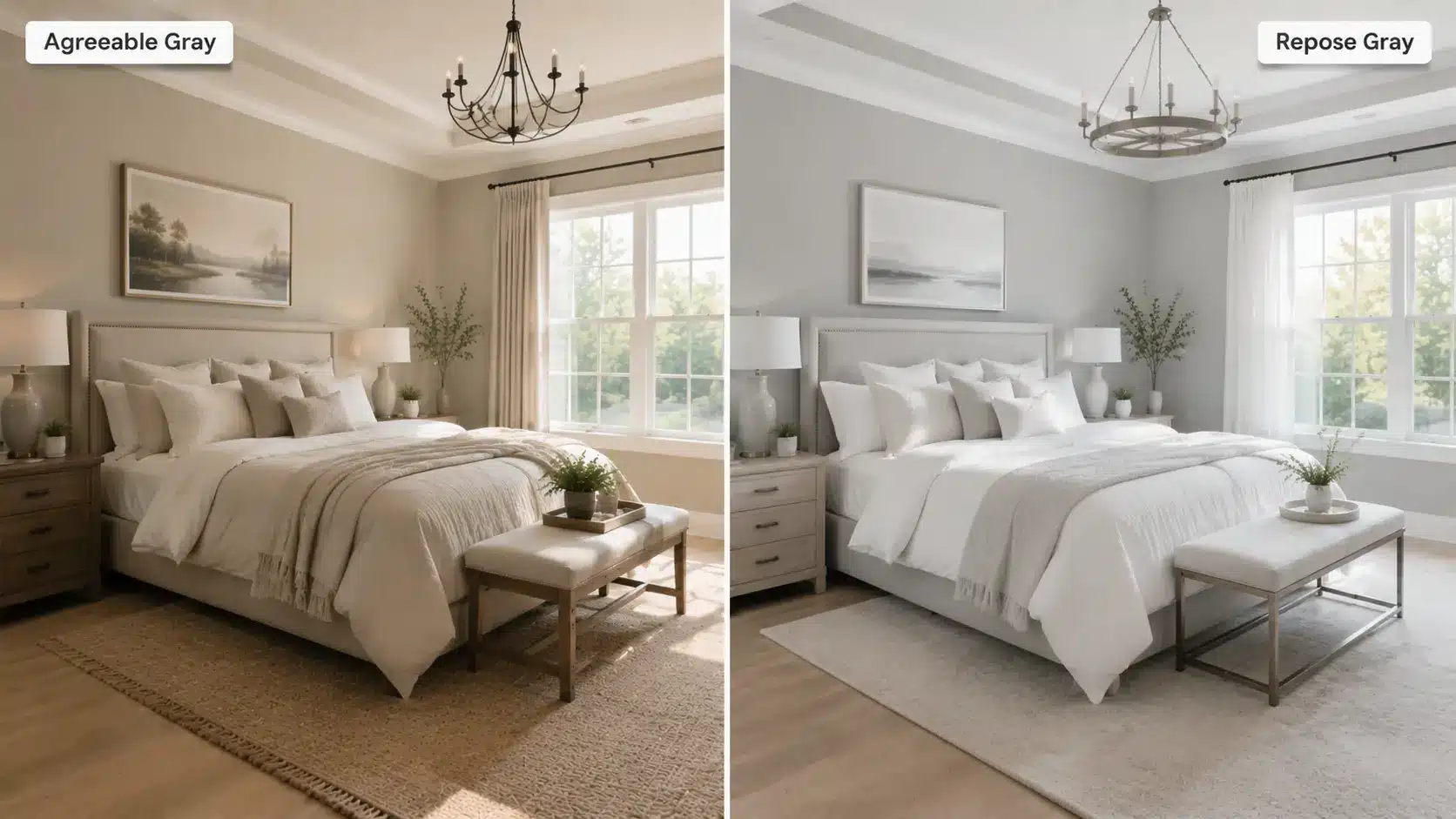
This is where Repose Gray actually edges ahead for many people. Its slightly cooler, quieter tone creates a calm, restful atmosphere.
Agreeable Gray works well too if you want a warmer, cozier bedroom feel. If you want spa-like and serene, Repose Gray is the pick.
Bathroom
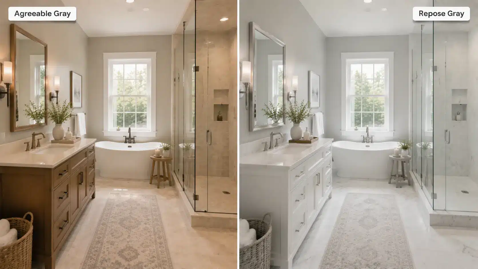
Agreeable Gray is a good option in bathrooms, especially those with warm tile or wood vanities. In low-light bathrooms, Repose Gray’s violet undertone can become more obvious. Agreeable Gray is the safer choice in poorly lit bathrooms.
Home Office
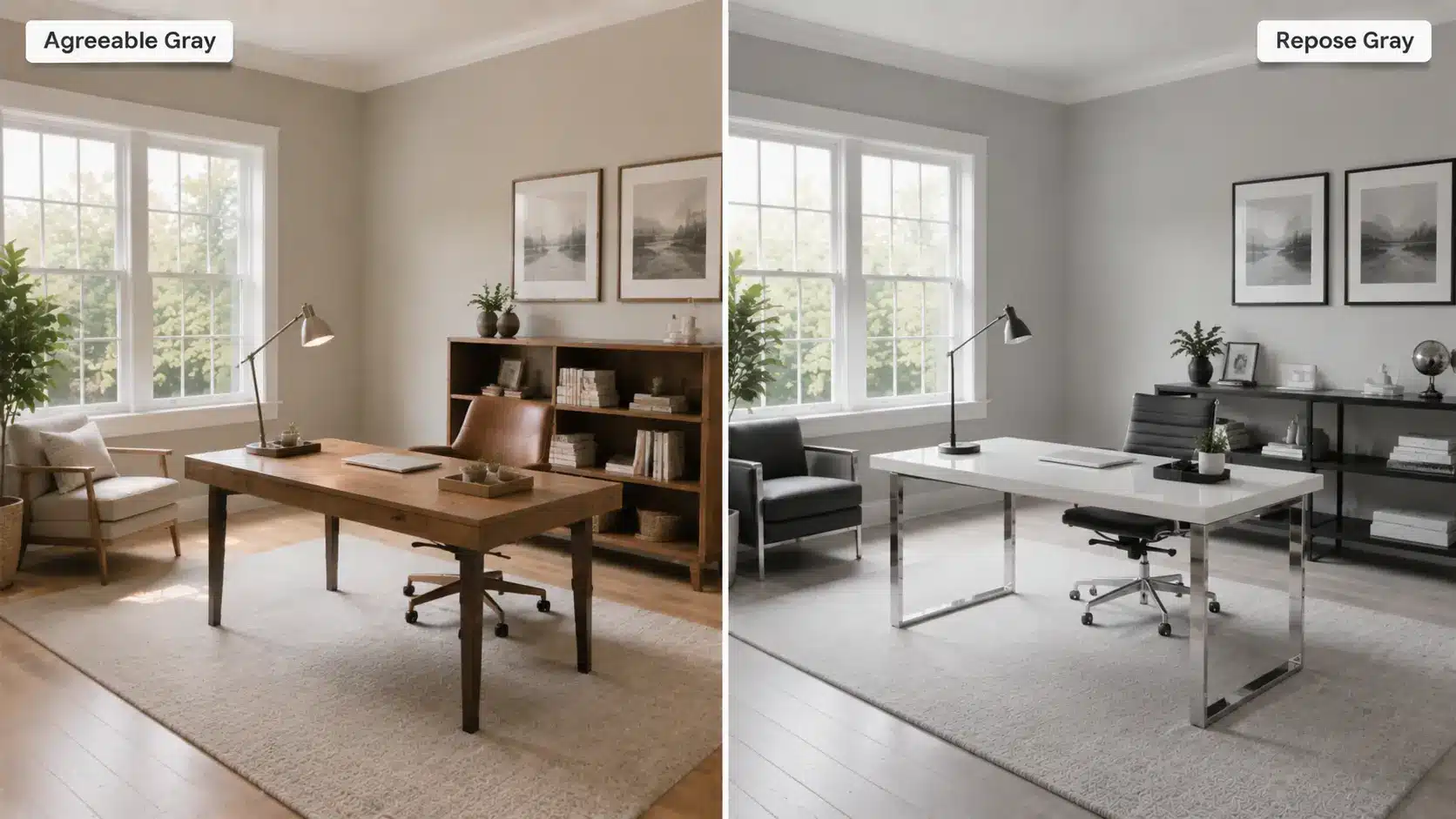
Agreeable Gray is better for most home offices because it is energizing enough to stay focused and warm enough to feel comfortable during long hours. Repose Gray can work in a bright home office but may feel slightly cold on gray-heavy days.
Exterior
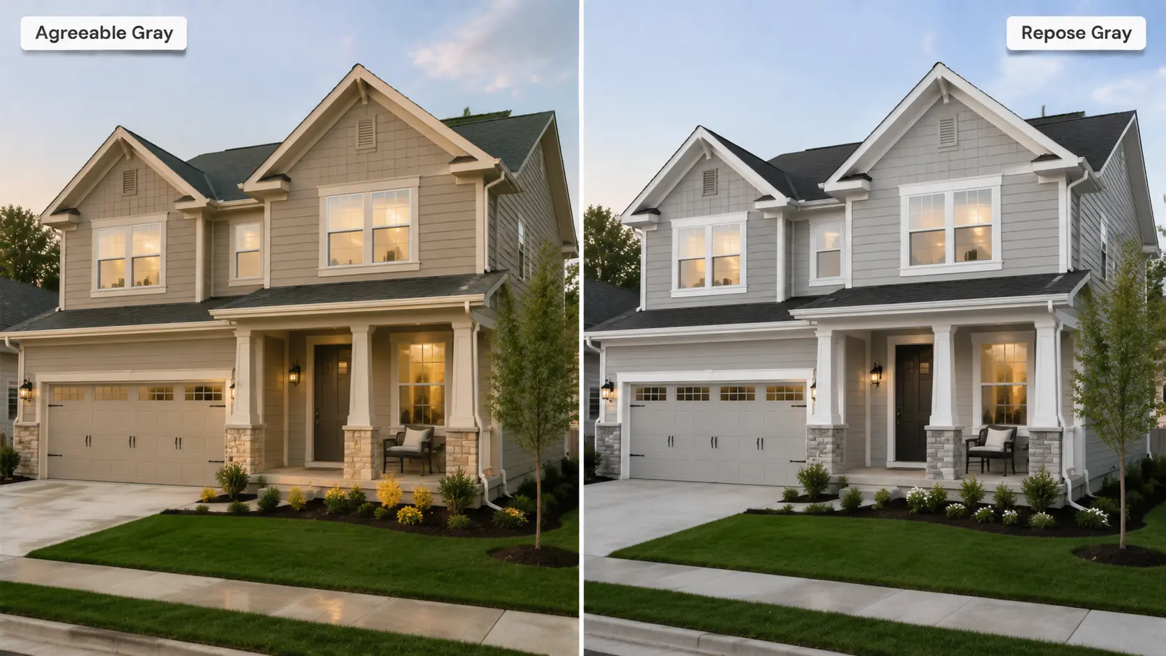
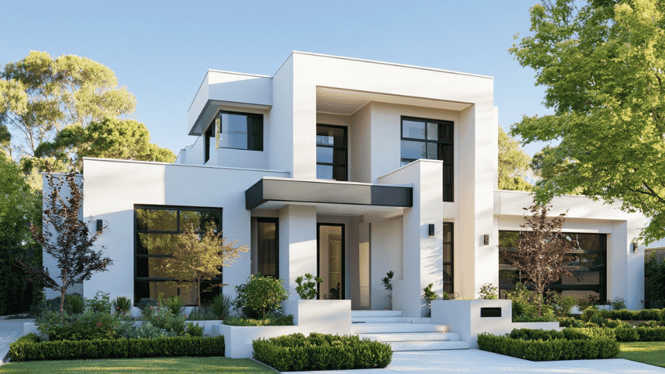
Both colors are used on exteriors. Agreeable Gray is one of the most popular exterior greiges and pairs well with brick, stone, and cream trim.
Repose Gray works beautifully on modern or contemporary homes with white trim. If your exterior gets a lot of west-facing afternoon sun and you want a true gray rather than a beige, Repose Gray is the better call.
Cabinets and Trim Comparison
Cabinets and trim can significantly influence how a paint color looks in your space. Choosing the right combination helps each shade look its best.
Which Paint Looks Better on Cabinets?
Agreeable Gray on cabinets creates a warm, lived-in look. It works well in kitchens with warm wood countertops or butcher block. It can read beige-y on cabinets in very bright spaces, so test a sample first.
Repose Gray on cabinets looks cleaner and more modern. It suits contemporary kitchens with white quartz countertops and stainless steel. The slight coolness keeps it from feeling too warm or casual.
Cabinet color is only part of the equation, since the right cabinet finish also affects durability and the final look.
Best White Trim Colors for Each
Agreeable Gray, Extra White (SW 7006), or Pure White (SW 7005) all create clean contrast without clashing.
For Repose Gray, Pure White (SW 7005) or Alabaster (SW 7008) work well. Alabaster adds a soft warmth that helps balance Repose Gray’s cooler notes.
Coordinating Colors for Agreeable Gray vs Repose Gray
The right coordinating colors can make either paint shade look even better. For a deeper look at how color combinations work together, this color schemes guide from the University of Delaware Library is a solid reference.
| Feature | Agreeable Gray | Repose Gray |
|---|---|---|
| Best Whites | Extra White SW 7006, Pure White SW 7005, Incredible White SW 7028 | Pure White SW 7005, Alabaster SW 7008, Aesthetic White SW 7035 |
| Accent Colors | Navy blue, warm terracotta, deep forest green, soft blush | Slate blue, charcoal, emerald green, soft sage |
| Wood Tones & Flooring | Best with warm oak, honey wood, and walnut floors. | Best with cool-toned LVP, gray hardwood, and most wood tones. |
Choosing coordinating colors is just as important as choosing the wall color itself. The right trim, accents, and flooring can bring out the best in either shade.
If you’re still deciding on accent colors, understanding gray color combinations can make it much easier to pair furniture, textiles, and décor.
When to Choose Agreeable Gray
Agreeable Gray is the better choice if you want a warm, versatile neutral that works in most homes. It performs especially well in spaces with changing light conditions.
- Best situations: warm or traditional homes, open floor plans, rooms with cool or north-facing light, spaces with mixed wood tones and warm decor, whole-house color if you want consistency.
- When to avoid it: rooms with strong blue or violet finishes where the beige undertone can clash, spaces where you want a clean true gray rather than a warm greige.
When to Choose Repose Gray
Repose Gray is ideal if you prefer a cleaner, more modern gray with subtle depth. It shines in bright spaces where its undertones stay balanced.
- Best situations: modern or contemporary homes, bedrooms where you want a calm retreat, spaces with plenty of natural light, kitchens with white or charcoal cabinets, rooms with cool-toned finishes.
- When to avoid it: north-facing rooms with minimal light; spaces with warm yellow lighting; rooms with beige or yellow decor, where the violet undertone can become more visible.
Repose Gray works especially well in homes with a mid-century modern style, where clean lines and neutral palettes are common.
Agreeable Gray vs Repose Gray: Pros and Cons
Every paint color has its strengths and trade-offs. Here’s a quick comparison of the biggest pros and cons of Agreeable Gray and Repose Gray.
| Agreeable Gray Pros | Agreeable Gray Cons | Repose Gray Pros | Repose Gray Cons |
|---|---|---|---|
| Warm and inviting | Can read beige in warm light | Cleaner, truer gray | Violet undertone can surprise you |
| More predictable undertones | Not ideal if you want a true gray | Works well with modern design | Harder to predict across lighting |
| Higher LRV, slightly brighter | May clash with cool-toned finishes | Versatile with cool-toned finishes | Can look lavender in low light |
| Performs well in north-facing rooms | May feel too warm in modern spaces | Beautiful in bright, airy spaces | Less cozy than Agreeable Gray |
Neither color is objectively better; they simply suit different homes and design styles. Consider your lighting, decor, and the atmosphere you want before making your final choice.
Which Paint Color Should You Choose?
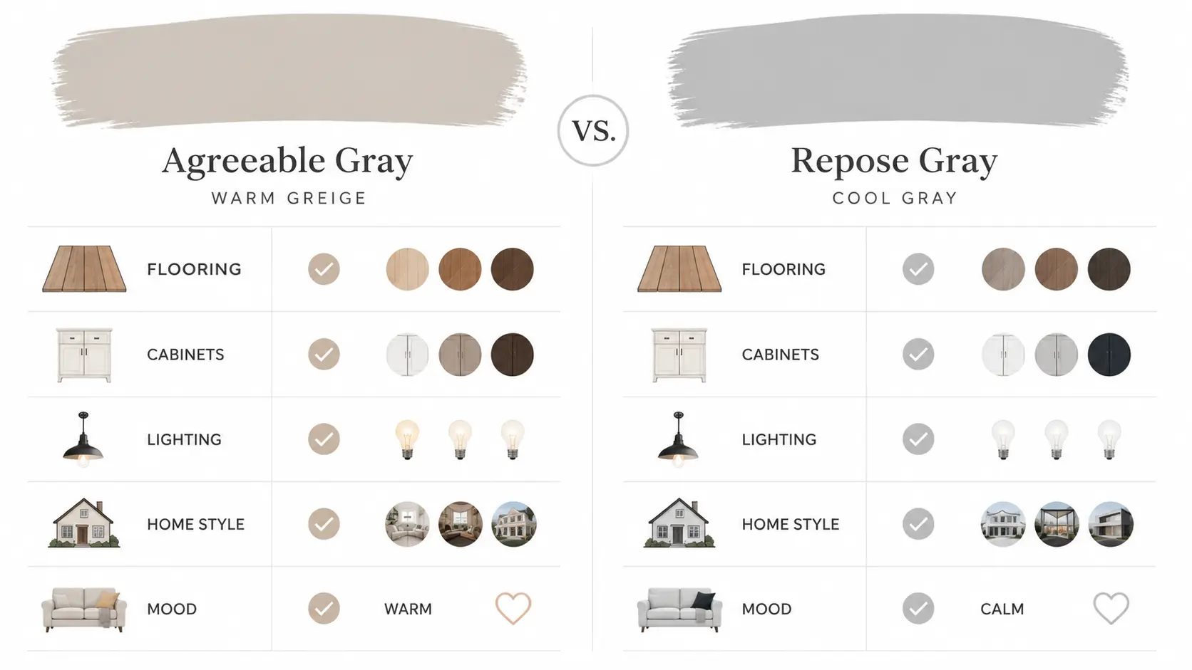
The best choice depends on your home’s lighting, finishes, and overall style. Use the guide below to quickly determine which color is the better fit.
- Warm vs cool home: If your home has warm wood floors, cream trim, or traditional decor, go with Agreeable Gray. If your home leans modern with clean lines and cool finishes, go with Repose Gray.
- Flooring: Warm oak or honey floors pair better with Agreeable Gray. Cool gray LVP or gray hardwood pair better with Repose Gray.
- Cabinets: Cream or wood cabinets sit better with Agreeable Gray. White or charcoal cabinets suit Repose Gray.
- Natural light: Low light or north-facing rooms need Agreeable Gray. Bright, well-lit rooms can handle either.
- Home style: Traditional, transitional, farmhouse, or coastal homes suit Agreeable Gray. Contemporary, minimalist, or Scandinavian-style homes suit Repose Gray.
- Desired mood: Cozy and welcoming means Agreeable Gray. Calm and polished means Repose Gray.
Conclusion
Agreeable Gray is warm and friendly, and it works in almost any room without much fuss. Repose Gray is cooler and sharper, and it fits modern spaces well.
The biggest mistake most people make is skipping the sample step. These two colors look so similar on a chip but behave very differently once they hit four walls with real light.
Buy a sample pot of each, paint large swatches, and watch them change through the day. Your walls will tell you which one belongs there. Trust what you see in your own space, not just on a screen.
Frequently Asked Questions
Is Agreeable Gray Good for Resale?
Yes, it’s one of Sherwin-Williams’ most buyer-friendly paint colors thanks to its warm, versatile look. It suits a wide range of home styles and appeals to many buyers.
Can You Use Both Colors Together?
Yes, as long as they’re used in different rooms or clearly separated spaces. Their different undertones can look mismatched when placed side by side.
Do These Colors Look Darker on Walls?
They can, depending on your room’s lighting and surrounding finishes. Always test a sample before painting an entire room.